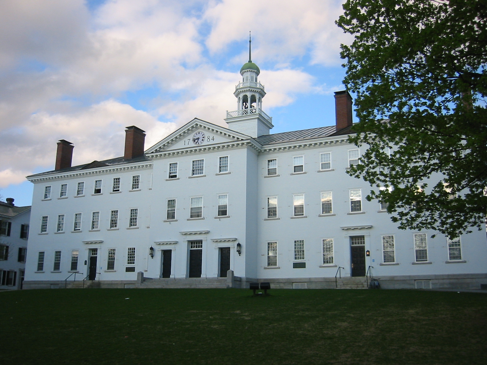
The temporary lack of shutters on Dartmouth Hall’s front facade gives the building an even more rudimentary, eighteenth-century appearance.
The temporary lack of shutters on Dartmouth Hall’s front facade gives the building an even more rudimentary, eighteenth-century appearance.
All three of Baker’s main doors, originally heavy 1928 metal revolving doors enclosed in apparently bronze-lined cabins, have been replaced with swinging doors of wood stained a light color and lacking either formal panelling or paint. (Earlier, it seemed that the western door, at least, would remain, since it is at the top of a stair and inaccessible by wheelchair.) Salvors sold off the original doors, and one at least is rumored to have been bought by someone who appreciates its history.
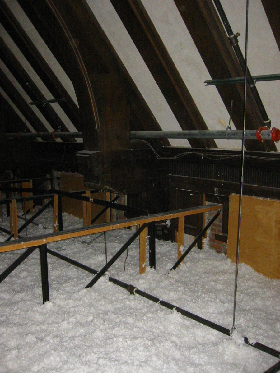
The parliamentary Faculty Room in Parkhurst Hall was largely demolished decades ago and a mezzanine inserted in its place, but a few of the roof beams remain in an unfinished attic.
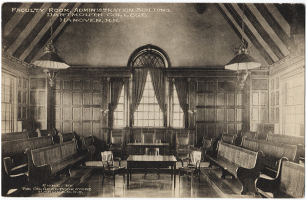
An earlier view of the room. Some of the benches, with their numbered seating spaces, can be found in the corridors of Parkhurst Hall.
Peter Christian’s (in the New York Times; in New London) was a Hanover tavern that occupied a basement at 35 South Main Street lined with dark wood, including beams salvaged from the oldest house in Hanover, the 1770 Storrs’ Tavern (D.K.E.). During the mid-1990s, Old Pete’s replaced it, then another tavern, then The Wrap. The Wrap has become a burrito place called Boloco, for “Boston Local Company.” (One customer was overheard describing a burrito to her deprived child as “like a wrap, but warm.”) When the wrap or the burrito place moved in, all of the old, dark interior was ripped out and presumably sold off. A Boloco clerk said that someone stole the bar one night.
The possibly-1860s granite post mentioned earlier as surviving the Kemeny Hall construction has been pulled, but the fact that it remains at the construction site encourages the speculation that it will be replaced when the building is finished:

The fitness center in the “gymnasium” at the top of Alumni Gym has opened (press release). Photos show a room far busier than when it was a forgotten space on campus.
Dartmouth Life reports on Professor Spicer’s discovery that architect Jens Larson based Sanborn House’s Wren Room on the salon at Bolton House, Linconshire (1685-1686, William Winde).
[Update 05.17.2006: Rod Miller made this attribution in his 1998 dissertation on Jens Larson, p. 28.]
Bruce Wood reports at Green Alert on town zoning approval for the Varsity House, noting the speed of the project and the fact that it will dismantle and reassemble the upper rows of the existing bleachers rather than demolish the whole structure — which seems very frugal.
The plans indicate that the football locker rooms will be located in the building, alongside the east side of the field. This probably means that both teams now will emerge from the visitors’ stands before each half.
Architect Bill McDonough ’72 had a piece in The Green Magazine (Winter 2005), Dartmouth’s environmental magazine. The entire issue focuses on sustainable design.
Baker Library has a variety of “twins” at other colleges, libraries that also look like Independence Hall, but its most unexpected sibling is the Maison Internationale at the City University of Paris (basic information), designed by the same architect, Jens Larson.
Although it is all chateau and no Philadelphia, it still has the flanking wings and the long reading room, as seen in an article in Label France magazine and interior photos.
Even the arcade joining the wings, a feature that was contemplated but not built at Baker, is very “Larson” and calls to mind the arcade joining Baker to Sanborn House.
The D has a letter to the editor confirming that the demolition of Thayer Hall is not expected to endanger Humphrey’s “Eleazar Wheelock” murals.
The Office of Planning, Design & Construction has revealed an unusual schedule of all the buildings and other construction projects to be completed on campus through October, 2010. This comes with a larger version of the master plan than has been available in the past. The documents state that:
-Bradley-Gerry demolition will end during September, 2007.
-The Life Sciences Building, which will stand east of Vail/Remsen, will be built starting early during 2007, with design starting soon. No architect seems to have been announced yet.
-Design for the dining hall to replace Thayer Hall will begin this summer. No architect has been announced for this project either, although Centerbrook was involved in the master planning for the student center area.
The latest McLaughlin photos show the buildings starting to look like a real place, with the view of the corner of Maynard and College now recognizable.
Architect Chris Grimley of Machado & Silvetti “is currently working on a consolidation of the arts programs at Dartmouth College into a single Visual Art Center.”
Although the universal acclaim for the firm’s $275 million renovation of the Getty Villa museum (New Yorker, New York Times) makes Dartmouth’s selection of the firm appear especially prescient, the best predictor of the appearance of the Lebanon Street building might be the firm’s University of Utah Museum of Fine Art.
Construction will start for the new building during the summer of 2008. Unfortunately, it will require the school to demolish the 1914 Clement Hall, Hanover’s best industrial building.
When Dartmouth started its current fundraising campaign in 2001, it expanded its small institutional news service into a full-fledged public relations team under the new office of the Vice President for Public Affairs. The creation of this office was by all accounts an overdue development. In the meantime, students took matters into their own hands by creating Buzzflood; the Tuck School has become a world center for the study of marketing; and alumni have discussed school “branding” (Class of 1963 newsletter).
The PR Office and currently has five members, as described in a profile in PR Week [pdf] and has hired the Manhattan PR firm of Plesser Holland. The firm is experienced in drafting materials and managing reputation but does not claim to be a design shop that focuses on creating logotypes and related images.
The most notable recent step of Dartmouth’s PR Office is the welcome issuance of the Dartmouth Editorial Style Guide during December of 2005 by its Office of Publications. The Guide sets standards for the use of Dartmouth’s Seal (1773, engr. Nathaniel Hurd), its Shield (1940, W.A. Dwiggins, modified 1957), and the lesser-used White Pine from its Bicentennial Flag (1969). The Shield is properly rendered in black and white; the Seal is properly reserved for official uses. The Guide also mentions an odd little Baker Tower sketch that might fit better in a clip art collection. (More information on the history of some of these designs may be found in the Library Bulletin.)
Dartmouth does not yet have a comprehensive set of “visual identity guidelines,” a set of standards that would cover the images mentioned above as well as lay out appropriate uses of an official typeface and coat of arms. Some schools developing clear and comprehensive guidelines that include all of these elements are Brown, Cornell, Cambridge.
A coat of arms is a heraldic device that would exist alongside the Seal and Shield, and it is something the College needs. The most recent proposal for a coat of arms features Dartmouth Hall (unlike the above devices, which feature hypothetical buildings) and includes the school’s motto as well as a buck’s head from the arms of the Second Earl of Dartmouth.
Dr. Good’s proposed arms, in black and white
Because a heraldic coat of arms is by nature an adaptable arrangement of colored elements on a field, this design would be suitable for a much wider range of applications than the Shield, which is exclusively a black-and-white line drawing.
Following are some indications that a coat of arms is needed:

This Shield uses colors other than black and white and incorporates an inappropriate drop shadow.

This shade of lavender (presumably derived from the face of Baker’s clocks) belongs in the palette, but this logotype makes the institutional subunit look more independent and important than the Tuck School.

The nonstandard logotype above diverges in size, font, arrangement, and color from the one the school should adopt; the Shield within it also is highly unorthodox. (Dr. Good also notes that it eliminates the Indians from Dartmouth’s Seal.)
This one uses an attractive but nonstandard version of the White Pine.
The point is not that the new guidelines, which would prevent most of the uses above, are being enforced insufficiently. The website of the Technology Transfer Office needs color in its graphic identification with Dartmouth. The point is that it is inappropriate to transform the Shield into some sort of color logo or coat of arms in graphic-design terms as well as heraldic ones, and that Dartmouth therefore needs a coat of arms, which may be rendered in color or black and white as well as abbreviated, with smaller elements standing for the whole.
The PR Office, as the manager of the school’s visual identity, is the proper body to request the official adoption of a coat of arms and to then specify its use in exactly these situations. The office is probably too busy at the moment, but if it ever commissions a set of visual identity guidelines from an outside firm, as the schools listed above have done, it should include a coat of arms in the specifications for the project. The variety of logotypes that Dartmouth needs (and already is trying to use) simply requires a coat of arms: a black-and-white line drawing from 1940, however traditional and useful in some situations, is far too limited for what Dartmouth requires.
[04.08.2006 altered slightly.]
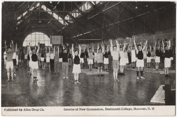
The Office of Planning, Design & Construction has posted several photos of February work on the drill hall or upper gym of Alumni Gymnasium.
Compare this early-twentieth century view:
 Â
 
Construction on the new Varsity House started February 22, and detailed information on the latest addition to Dartmouth’s 113-year-old athletic park appeared on line last week.
The building has a project page that includes several November 2005 renderings that now depict the building in red brick, like the Gym, rather than in the green panels implied by the last rendering released.
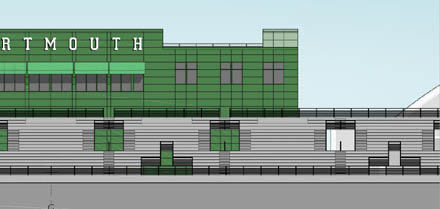
This early design dated June 10, 2005 will not be built.
The Park Street facade, which will become the right field wall for Red Rolfe Field, is visible for the first time, and the site plan appears to indicate that Rolfe gets a new foul pole.
The third level plan indicates that it will contain mostly offices, with the prime spots overlooking the field held by a meeting room, a conference room, and a sort of lounge — a big room with comfortable chairs, not the row of skyboxes one might have expected.
Contrary to previous speculation here, the existing east stands will not be demolished, only partially disassembled and reinstalled to the south, in front of Leverone.
Dartmouth announced today that Bruce ’78 and Diana Rauner and Jack ’74 and Debbie Thomas will have two of the three dormitories in one of the trios of the McLaughlin cluster named for them.
That leaves one building without a name…