A new coat of arms for Graduate Studies

Graduate Studies at Dartmouth (or “the Graduate Studies programs,” collectively lowercase) haven’t given the impression that they form a single school or college. Over the past several years, however, they have unified under a logo comprising the Old Pine, likely derived from the Bicentennial Flag, inside an oval. The oval logo is reproduced in a prior post and is vestigially visible on the current Grad Studies site.

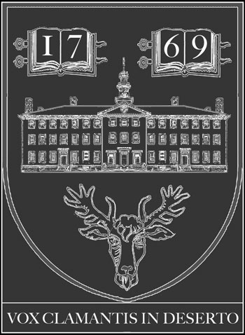
Now Graduate Studies have a new coat of arms with a kinship to those of the other schools:

New coat of arms for Graduate Studies at Dartmouth

Graduate Studies coat of arms, from Graduate Studies

This shield has a woodcutty form similar to that of the recent Thayer School arms. The year “1885” (I think) in the base would be the year that Dartmouth granted its first Ph.D. degree; there is no singular institution here to claim a foundation date. (Some sources have Dartmouth giving a Ph.D. in 1877 to astronomer John Robie Eastman of the Chandler class of 1862.)

This iteration seems to place the numerals with a bit more success, from the DCHCDS site:

New coat of arms for Graduate Studies at Dartmouth

Graduate Studies coat of arms from DCHCDS application

The white pine is carried over from the earlier oval logo, and below it the lines of the New Hampshire hills create a depression rather than the rising hill (a peak of enlightenment to be ascended, etc.) found on Dartmouth’s seal. The lines also read as a pair of cradling hands.

It turns out this coat of arms is the product of a competition held last October. The competition brief required a representation of waves (have I misread those lines? The tree is growing out of the upper line) and referred contestants to the shields of Tuck, Thayer, and DMS — but not of Dartmouth itself. The brief also required entries to show the year 1960, which is when the current crop of grad programs began, and that must have been regarded as the “founding” year when the brief was published. There is a discussion in the comments about the advisability of dividing the year into two pairs of numbers, and some question about how and when during the competition the year 1885 was substituted for 1960.

All of the competition entries are available for viewing. Several alternate between the Grad Studies pine and the Bicentennial pine; several follow the Tuck School example fairly closely. One from SB Design deserves credit for depicting Wentworth Hall, the Grad Studies headquarters. Another sort of quarters the arms of the three Associated Schools, using the paths on the Green to divide the shield. The winning designer was Scott Gladd. (He has some alternative versions, including an intriguing one with Baker Library, in his portfolio.)

Now the logotypes of Dartmouth and its Associated Schools and related entities, as they are lined up at the bottom of the DCHCDS site, are one step closer to complete congruity. Only the hospital, the Institute for HP&CP, and the DCHCDS itself are without coats of arms.

Isn’t this interesting. Where the symbols of the appropriate programs are lined up for an online application form, both DIHPCP and DCHCDS (noted above as lacking logotypes) are represented by Dartmouth’s shield:

Arms of four programs

Row of logotypes from application.

—-
[Update 08.31.2013: Broken link to Gladd replaced.]
[Update 04.25.2011: Minor wording changes and date correction.]
[Update 01.22.2011: Second image replaced with better version; note about row of four logotypes added; competition information added.]
The coat of arms on a pair of shoes, and other items

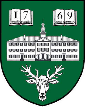
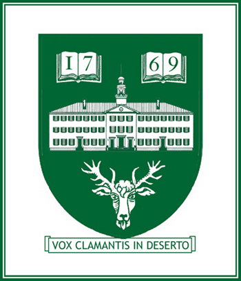
  • New Balance has put Dartmouth’s current midcentury coat of arms on the tongue of a pair of shoes in its Ivy League Collection (via the Big Green Alert Blog; there’s a post on The Dartmouth‘s blog).
  • Rauner’s blog has notable items on Cane Rush, Foley House, “the Glutton’s Spoon,” and the practice of “horning.”
  • The Valley News has an article on the renovation of the 1890 Wilder Church. The church had a lot of Dartmouth associations early on and is another benefaction of Charles T. Wilder, donor of Dartmouth’s physics lab.
  • Plan N.H. is the state’s “smart growth” group, and it gave a 2009 Merit Award to the South Block project.
  • There is a photo of the Zantop Memorial Garden in Dartmouth’s Flickr photostream (story in The Dartmouth, dedication program). It looks like the garden finally resolves the former awkwardness of the slope in front of Richardson Hall: never a proper stone-walled terrace, but too extreme to plant with grass and try to ignore.
  • The last remnant of Campion’s various long-lived stores on Main Street closed last fall (The Dartmouth, Valley News).
  • The Dartmouth reports that the [flower-] painted panels in the ceiling of Thayer’s main dining room contained asbestos and are being removed.

—–
[Update 05.03.2014: Broken links to PlanNH pages replaced.]
[Update 01.05.2013: Broken link to The Dartmouth repaired, broken link to The Dartmouth‘s blog removed.]
[Update 01.22.2011: Links to shoe and horning articles added.]

The Carnival Centennial

The Dartmouth Winter Carnival turns 100 years old in 2011 (Yankee Magazine has an article and slideshow, and Dartmouth Now has an article with video). A new book celebrates Carnival posters (see Rauner Blog). Accompanying the book is an exhibit in Baker (news item, Alumni Magazine has article, photo in the college’s Flickr photostream).

This year’s center-of-campus statue is an attempt to recreate the first official sculpture, of 1925 (The Dartmouth).

[Update 01.22.2011: Links to articles in Dartmouth Now and The Dartmouth added.]

The Dartmouth Arms

Jonathan Good wrote a proposal for a heraldic coat of arms for Dartmouth College in 1995. This website has linked to Good’s pamphlet at several locations over the years and is happy to host it once again.


As the proposal explains, the new symbol would be an adjunct to the existing coat of arms rather than a replacement for it.

The celebration of Dartmouth’s 250th anniversary in 2019 would be a fine time to adopt the coat of arms. At the last big college celebration of this kind, the 1969 bicentennial, the school adopted the lone pine device that has since become widespread.

The school might even petition the College of Arms for a grant of honorary arms, as has been done by George Washington University and Hampden-Sydney College.

A few of Scott Meacham’s own cut-and-paste efforts to render the proposed arms:

Proposed arms for Dartmouth as designed by Good and depicted by Meacham

Proposed arms for Dartmouth as designed by Good and depicted by Meacham

Proposed arms for Dartmouth as designed by Good and depicted by Meacham

—–
[Update 11.17.2012: Broken link to HSC page fixed.]
[Update 11.30.2010: GWU link corrected.]

Recent Dartmouth-related notes not involving construction

Various tidbits not related to construction:

  • Google has supplemented its car-based Street View coverage of Hanover and Lebanon by sending in a tricycle-mounted camera (The Dartmouth). New images will be up next year. Meanwhile some places, such as the University of Texas, are getting 45-degree aerial views, presumably taken from an airplane.
  • Professor Schweitzer’s Occom Circle Project involves digitizing and posting Samson Occom’s writings (The Dartmouth, Dartmouth Now). The project doesn’t seem to have a page yet.
  • Rauner’s blog has a copy of an early-1900s broadside advertising a ban on nude swimming near Ledyard Bridge, and a bit on the legendary Doc Benton.
  • As everybody knows, BlitzMail is going away. An oblitzuary.
  • Ask Dartmouth writes about the Old Pine Lectern.
  • Ken Burns wrote in American Heritage that his favorite baseball photograph is an 1882 image showing a Dartmouth-Harvard game on the northwest corner of the Green. Photographer Joseph Mehling has paired that photo with shots from a recent softball game on the northeast corner, with President Kim pitching.
  • This excellent fantastical map of the campus by Matthieu and Zachary Pierce is called “Dartmouth Dreaming.”
  • Administrative reports and presidential announcements, such as the Reaccreditation Self-Study, now regularly mention the planning for the 2019 Quartomillennium.
  • The Dartmouth Sports site has been redesigned and is now a little less busy.

—–
[Update 12.02.2012: Broken link to Google post at the blog of The Dartmouth removed; broken link to 1992 American Heritage article removed.]

Graphic design and signage

The library had a contest to select a design for its new favicon/logo, formerly the tilted D. The winners (pdf) are surprisingly heraldic.

This might have been mentioned before, but the staff in the DMS shield has been genericized. It used to be an Indian-head cane.

Dartmouth has its own typeface, or at least the capital letters for a typeface, writes the Rauner blog. Will Carter designed Dartmouth title (Rauner’s sample) around 1969 for use in inscriptions in the teak panels in the Hopkins Center. The present king of collegiate typefaces seems to be Matthew Carter’s ca. 2008 Yale (see also Yale Daily News article), although Frederic Goudy’s 1938 University Old Style for Berkeley is an earlier example that lives on in Richard Beatty’s 1994 redrawing as UC Berkeley Old Style.

For years, Smith College tapped into certain associations (unintentionally?) by using ITC Garamond, which paralleled the Apple Garamond of Apple Computer advertisements at the time (Wikipedia on Apple typography; Smith’s current Visual Identity Program). The quality of the design itself is important, and distinctiveness is not everything (see the Typotheque article on the modification of Brioni for Al Gore).

With the Visual Arts Center about to go up next door to the Hopkins Center, it’s time to finally commission an artist (Colossal Media, say) to paint signs on the Hop’s largely-blank rear walls. The walls of Spaulding Auditorium (Street View) and the huge fly loft at the rear of the Moore Theater are ripe for advertisement.


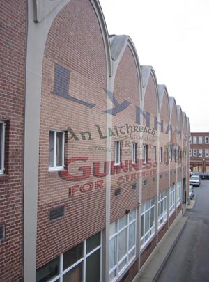
Sign concept for west facade of studio row, Hopkins Center (partially based on a photo from http://philip.greenspun.com).

The destruction of a genuine ghost sign at the unique industrial/commercial campus of the University of Washington, Tacoma recently caused some controversy (News Tribune).

—–
[Update 11.17.2012: Broken link to Smith program fixed.]

Rauner’s blog keeps going

Rauner Library’s blog has sent out a raft of interesting illustrated posts lately, on Howard Lines 1912 and his memorial in Baker; SS Dartmouth Victory, a Victory Ship; Adrian Bouchard, Dartmouth’s official photographer from 1937 to 1976, except for the 1941-1945 period; Orozco and his frescoes in Baker; and gravestones of the Risley family, stonecutters in the early nineteenth century.

[Update 07.28.2010: Erroneous Bouchard years 1837 to 1876 corrected.]

Olympics, skiing, and Carnival posters

The US News article on college Olympians (see also USA Today and Dartmouth’s recap) notes that Dartmouth’s is the first collegiate ski team. Another significant tradition is the the ski team’s organizational existence outside of the athletic department. The team is part of the outing club instead, following a 19th-century way of running things.

The Dartmouth Alumni Magazine, now on line with archives back to July 2008, has issues featuring the DOC Centennial (see also the Congressional recognition) and the Olympics.

Dartmouth Life has an article on Carnival posters that mentions Winter Carnival: A Century of Dartmouth Posters (Hanover, N.H.: University Press of New England, forthcoming fall 2010).

Hanover engineer and architect Edgar H. Hunter, a 1901 graduate, designed promotional posters for the state’s ski industry, including one from 1935 pictured in E. John B. Allen’s New Hampshire on Skis (Arcadia, 2002), 2. His son Ted Hunter ’38 was an Olympic skier and also an architect.

Graphic design downtown

Speaking of graphic design, the new hotel on South Street (behind Hanover Park, where Panda House used to be) has been named Six South Street and has been given a logo by Vreeland Marketing & Design.

detail of Six South Street logo

Detail of logo

While the hotel is to be welcomed and its builders admired for their boldness and attention to urban design, the logo deserves some criticism:

The word “Street” really should be written out. While “South St.” might be part of an address, the thoroughfare that gives its name to the hotel is “South Street.” The word “Six” seems to have been spelled out to add formality or pretense, the way it is in “The Wall Street Inn” (not the plain-old “Wall St. Inn”). So the word “Street” should be as well. Only an address plaque on the building should read “6 South St.” After all, both “Six” and “South” have shorter versions that could have been used but weren’t. And even though “Hotel” is on its own line, it still makes the logo seem to refer to a “Saint Hotel” (“St. Hotel”).

When a word is abbreviated, it requires a period. Probably to prevent the letters “ST” from appearing to retreat from the righthand edge, the logo omits the period. This should have been solved some other way.

—–
[Update 12.02.2012: Broken link to MCHG image removed.]
[Update 11.17.2012: Broken link to Vreeland fixed, two broken links to MCHG removed.]