Williams Tsien and a Manhattan museum

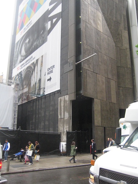
Tod Williams Billie Tsien Architects, the designers of the upcoming Hood Museum expansion and Wilson Hall renovation, are in a strange position regarding their building for the American Folk Art Museum in Manhattan. The refined and well-regarded Modernist building is only a dozen years old and yet is likely to be razed — by its neighbor and owner, the Museum of Modern Art (Times story and blog post, background from Christopher Gray, overview at New Yorker blog).

The firm has a short statement about the museum building on its website, along with photos taken shortly after completion. Here is a Street View of the building made when it was still in use:


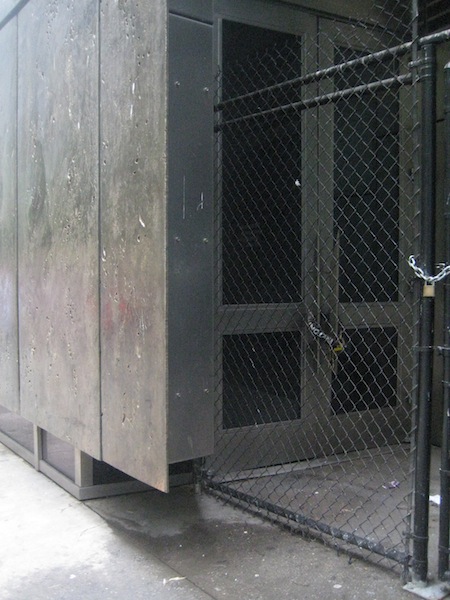
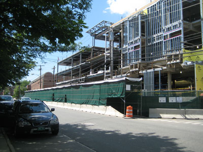
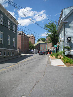
The building was fairly desolate on Wednesday:

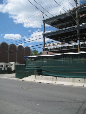
American Folk Art Museum, Meacham photo

American Folk Art Museum, Meacham photo

But then on Thursday MoMA announced that demolition was not assured, that the building’s fate would be left up to the expansion architects, Diller Scofidio + Renfro (New York Times).

—–
[Update 05.12.2013: Three links to Flash content on TWBTA site removed, New Yorker link added.]

Alpha Phi photos up

The firm of Haynes & Garthwaite has photos of the new Alpha Phi sorority house. There is an interesting selection of models available to the prospective sorority builder: the nineteenth-century frame domestic buildings in which several sororities are housed, the early-twentieth century Georgian clubhouses of the fraternities, and the twentieth-century suburban houses with which many students will be familiar.

(Another project page that’s coming up is that of the Hood expansion by Williams Tsien.)

The graphical Green; arts events

As seen at Dartmouth Now, the Year of the Arts logo initially reads as a cluster of cinema searchlight beams:

But of course it is a map of the paths on the Green, with north to the left. A larger version of the logo at the festival’s website takes on the appearance of a print, or perhaps a painting.

Coverage of the opening of the Visual Arts Center may be found in The Dartmouth and Dartmouth Now. Hood Director Taylor speaks about the Kelly sculpture and its aircraft-grade aluminum in video. The Valley News has a story on the Hop at 50, and the Year of the Arts site has a timeline of the arts on campus beginning with 1962.

Revealing the spaces within Wilson Hall

Billie Tsien, in an interview in the latest Hood Quarterly (pdf):

After walking through Wilson Hall, I just can’t wait to clean out everything and take a look at the bones. There are some incredibly beautiful and very powerful spaces in Wilson Hall, and stripping it down will help us to see, for example, the height of the top floor and the skylight. People are really just going to be blown away.

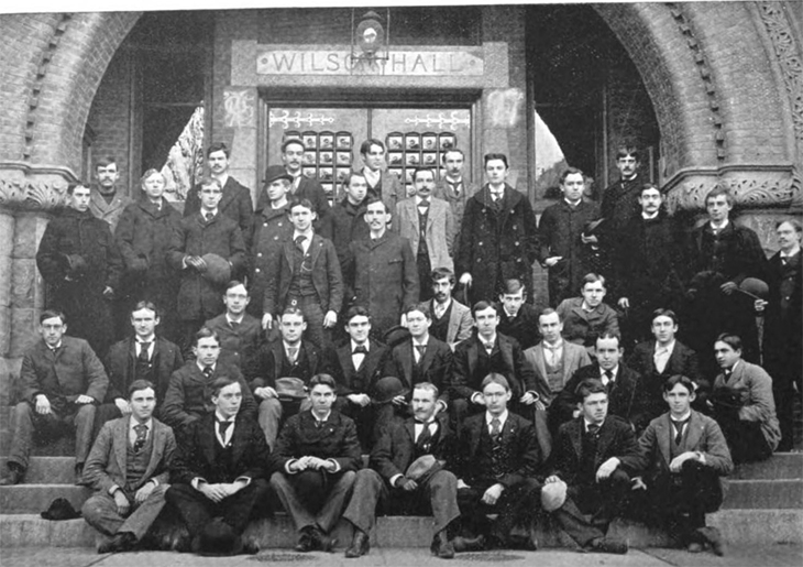
This 1894 photo shows the building’s front entrance.

Wilson Hall entrance 1894

1894 photo of Theta Delta Chi chapter, from Omicron Deuteron, The Shield [of Theta Delta Chi] 10:1 (March 1894), 52 (from Google Books).

Director Taylor on the Hood Expansion

Lee Rosenbaum at CultureGrrl has a post on the selection of Williams and Tsien as architects for the expansion. She quotes Hood Director Michael Taylor:

What really drew me to their work was their additions to the Phoenix Art Museum, which I think are superb, and the David Rubenstein Atrium at Lincoln Center. Seeing the latter blew me away, since I saw how they could transform the Hood Museum’s entrance, while the former gave me a sense of what our new galleries could look like.

Rosenbaum also filmed an interview with Taylor in front of Wilson Hall, and she presents the video in the post. A few interesting things he mentions: the building is likely to include a “light box” and the new entrance will contain lots of glass and lights and possibly a big “Hood Museum of Art” [sign]. Wilson also will include a visitor services area and possibly a café.

Taylor also says that the archway where the Hood and Wilson connect will be replaced with the museum learning center. He probably means the arched door opening in the hyphen, not the iconic trabeated concrete gateway of the Hood itself.

Images of past work by the firm show at least a few formal similarities with the Hood, including the use of glazed brick and concrete and the interest in long flat spans, sometimes uncomfortably long in the case of Williams and Tsien. The firm’s project seems unlikely to refer to Wilson’s arches.

Past projects that seem most likely to be echoed in the Hood expansion are visible in images from the firm’s site: Skirkanich Hall at UPenn (another, an exterior); the Phoenix Art Museum (another); the Mattin Student Center at Johns Hopkins; the American Folk Art Museum; and of course the David Rubenstein Atrium at Lincoln Center (with its exterior entry).

The Hood will close about a year from now and reopen during the Spring of 2015.

—–

[Update 05.12.2013: Nine links to Flash content at TWBTA site removed.]

[Update 07.07.2012: Spelling correction and minor wording change made.]

The next Visual Arts Center

I. Introduction

The nearing completion of the Visual Arts Center points up the current underuse of the site next door at the corner of Crosby and Lebanon Streets.
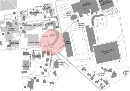
Crosby and Lebanon Streets, existing

Existing conditions. All maps based on official campus map (pdf).

This is a large and important site. Whatever building goes here — let’s assume it is an arts-related building — will be visible to visitors arriving on Lebanon Street. It will need to be a gateway building, as the 2000 downtown Hanover plan illustrates so thoroughly. The Rogers Marvel 2002 Arts Center Analysis (pdf) also emphasizes the potential of this site on page 38.
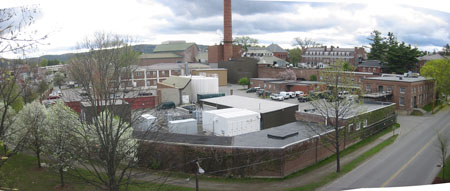
author photo of Crosby and Lebanon Streets, 2006

View to the northwest showing the corner, 2006.

The first impulse is to follow the footprint of the existing low-scale facilities building. But this site is not only large, it is also unusually malleable. The college and town might be able to relocate Crosby Street in radical ways to completely reshape the ground available for the gateway building.

Why might Crosby be changeable? Because it has been changed in the past. Crosby Street was first laid out in 1872, to separate the state farm on the east from the state college dormitory site and other buildings on the west.

Crosby Street originally ran straight through to Lebanon Street. It was not until the early 1960s that Crosby’s southern delta was given its current incongruously suburban form. When Dartmouth sought permission to close down South College Street for the Hopkins Center, the Town asked Dartmouth to rework Crosby Street in return, aligning the street with Sanborn Road to form an ex post facto four-way intersection.
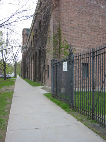
author photo of Memorial Field, 2006

View to the north showing the front (west) facade of Memorial Field, 2006. The sidewalk preserves Crosby’s original alignment.

Should we worry about Sanborn Road if Crosby is realigned? No. In fact, the downtown Hanover plan proposes in text and an illustration that Sanborn Road be blocked off. Instead, Hovey Lane will give access to this neighborhood through a short outlet punched through to South Street (see map below).

Would the abandonment of Crosby Street’s current alignment open up any possibilities for a college building on the corner? Each of the following proposals assumes that McKenzie Hall/Shops on Crosby is preserved; Sanborn Road is rerouted; and commercial buildings are built on the college land along the south side of Lebanon Street.

II. The Maximum Arts

The gateway building could expand to fill all of the empty land added to the corner:
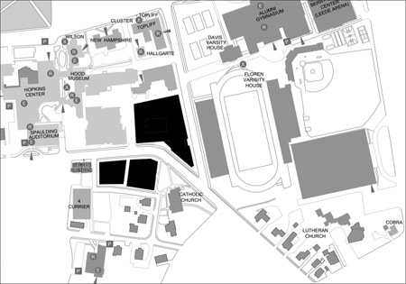
maximum arts proposal

The maximum arts proposal.

This plan would block an important view of Memorial Field and make Crosby Street into a narrow tunnel. A good use of space, but not good preservation or townscape.

Some variation on this plan, however, might be a good one:
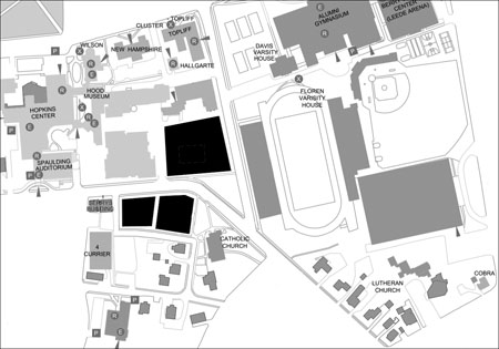
variation on maximum arts proposal

Variation on the maximum arts proposal.

III. The Minimum Arts

Crosby could be pulled to the west, adding a big empty lawn in front of Memorial Field:
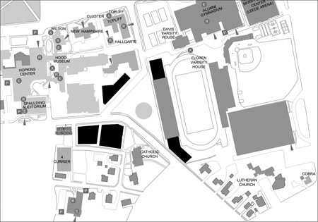
minimum arts proposal

The minimum arts proposal.

This plan would not make efficient use of space, and its creation of new lawns would not actually improve the view of Memorial Field.

IV. The Square and Temple

A big public square could be carved out of the surrounding buildings:
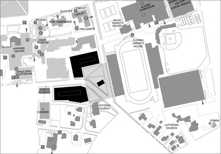
square and temple proposal

The square and temple proposal.

If the big square feels barren, a little temple that shares an alignment with nothing else could be dropped down in front of Memorial Field.

This plan would take advantage of the interesting fact that both Memorial Field and St. Denis Roman Catholic Church were designed in the early 1920s by Jens F. Larson. The two buildings appear to be perpendicular to each other, both aligned with Crosby Street.
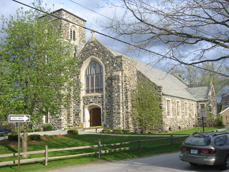
author photo of St. Denis, 2006

View to the southeast showing north (front) and west facades of St. Denis, 2006.

—–
[Update 11.17.2012: Broken link to Memorial Field image fixed.]
Details on Centerbrook’s master plan for the Hood expansion

Centerbrook’s page for its master plan for the Hood suggests that the existing connector to Wilson Hall could be preserved, and it shows the new addition as rising behind the connector.

rough Hood addition plan
Rough sketch of Centerbrook proposal. Base plan from Rogers Marvel 2001 Hood Program Study (pdf).

The addition will obscure most of the front of the Hood Annex, but it will be largely hidden from the Green. In this conceptual plan, at least, the addition is given a signpost in the form of a sort of Joseph Hoffmann ziggurat.

This plan is only a general guide, but it suggests that the preservation of the Wilson Hall entrance is a lost cause. The second and third images on the page show the entire entry below the arch — the stairs, vestibule, door, fenestration, and inscribed granite lintel — demolished and replaced with glazing.

Wilson Hall’s front door will become the Hood Museum’s new principal entry and be transformed by large glass windows to convey transparency and engage passersby on the busy campus green.

A Romanesque building is not the best place to look for transparency… Perhaps a projecting pavilion supporting prominent signage would be just as good, and would also preserve the building’s most distinctive elements. Living with an obtrusive but well-designed entrance and ramp structure outside the building would be a small price to pay to retain the experience of passing through the building’s substantial doorway, with its surfaces of oak, brick, granite, sandstone, and glass.

This master plan led to the Basis for Design for the expansion, and that document will lead to the designs that Williams and Tsien are now beginning. Little more than the general siting of the addition is likely to carry over from the master plan.

More details on that Basis for Design from Art New England (pdf), published a while back:

We intend to go back to the original skin of the building by tearing out the offices and dropped ceiling and returning the Picture Gallery to its original state.

Hood Director Matthew Taylor is referring to Wilson Hall. That link is found in the Hood’s comprehensive page of links about the selection of Williams and Tsien.

—–
[Update 03.28.2016: Broken code in Hoffman link fixed.]
[Update 01.13.2013: Broken link to Palais Stoclet image replaced with Hoffman link.]

Future excitement: the expansion of the Hop

Dartmouth recently announced that it has “initiated a renovation and expansion project for the Hopkins Center and will be selecting an architect in the coming year.” Because the Hop is so large, loved, and important, this is sure to be an interesting project.

On the occasion of the Hopkins Center’s 50th anniversary, the alumni magazine has published a photo essay on the Hop of today and collected reminiscences.

Reading Jonah Lehrer’s New Yorker article mentioning the Pixar building and how Steve Jobs concentrated the restrooms in one place as a way of forcing interaction among employees reminds one of the Hinman Boxes and their placement in the Hopkins Center with the specific intention of exposing students to the arts.1Bohlin Cywinski Jackson designed the 2002 Pixar headquarters, the most important Apple Stores over the years, and Dartmouth’s Class of 1978 Life Sciences Center.

The Black family’s gift for the Visual Arts Center includes the funding of an artwork by Ellsworth Kelly that will be attached to the east facade of Spaulding Auditorium this year (The Dartmouth). See this Street View for the likely site.

The publicity around the Hood expansion and the arts center refers to “Dartmouth’s new Arts District.” It seems that neither “Hopland” nor “SoWhee” has taken hold.

There is the challenge of adding to a notable building by a big-name architect, Wallace Harrison. The various firms doing careful insertions in and around the Harrison-planned Lincoln Center, including Tod Williams Billie Tsien, would be worth considering (Lincoln Center page, Times Topics).

Two recent master plans have proposed that the college graft a variety of additions onto the sides of the Hop:

It will be interesting to see where the new additions will go and how they will look. Will the Hop’s studio range really be demolished and replaced, as the Rogers Marvel plan proposes? Will the blank wall on Lebanon Street really get a row of shops, as the Brook McIlroy plan proposes? Will a northern addition expand the Hop proper toward the Green, alongside the original and iconic Moore Theatre? Stay tuned.

———————-

[Update 07.07.2012: Link to DAM article added.]

———————-

References
1 Bohlin Cywinski Jackson designed the 2002 Pixar headquarters, the most important Apple Stores over the years, and Dartmouth’s Class of 1978 Life Sciences Center.

Yes, Wilson will become the Hood’s main entrance

Dartmouth is putting into effect that Centerbrook master plan noted here on the 4th.

The college took proposals from four firms and today announced the selection of Tod Williams Billie Tsien as the architects for the project (Office of Public Affairs Press Release, Times ArtsBeat).

The project will add museum space behind Wilson Hall, renovate Wilson itself, and turn Wilson’s great arched entrance into the main entrance for the whole Hood Museum complex.

It is difficult to emphasize too much the importance of Wilson’s arch. When Dartmouth published some of Robert Frost’s reminiscences about how he decided, in Wilson Library, to become a poet, it titled the pamphlet “Under That Arch” (American Memory).

Luckily the granite lintel bearing Wilson’s name is not very prominent and can be left in place. A new glass entrance pavilion projecting from the arch or attached to the front of the building will be able to display Hood’s name. The firm’s David Rubenstein Atrium at Lincoln Center (image) suggests one approach the firm could use.

During 1996 I spent about a month living in a Williams/Tsien building at U.Va. (Hereford College, 1992). I had some reservations about the overall project, a residential college on the back of a hill far from the center of campus (map). Because it is sited on a slope, it has trouble enclosing the sort of meaningful outdoor spaces you would expect: it is an arrangement of objects in a park. But I was impressed by the cool and serious Modernism of the individual buildings and their willingness to adopt a monumental scale when required (images from Tinmanic’s Flickr photostream and Wikipedia) . I liked the use of what I assume are local brick and slate on the exterior, and although the cinderblock interior was not ideal for a dormitory, it had a sternness that would be appropriate for a museum.

The firm’s work is serious and purposeful rather than frivolous, and in small doses it could create an exciting tension with Wilson’s Romanesque arches, the Hood’s Postmodern whimsy, and the Hop’s Modernist Expressionism.

—–

[Update 05.12.2013: Two links to Flash content on TWBTA site remove.]

[Update 07.07.2012: The Hood has a roundup of coverage of the announcement. Thanks to Alex Hanson for the quotes in the Valley News article (Hood-supplied pdf).]

Wilson Hall could become the Hood’s main entrance

LC AmMem Wilson Hall

Wilson Hall, from American Memory

This announcement did not get much publicity when it was published almost a year ago, but it is noteworthy: Centerbrook has completed its master plan for the Hood Museum, and the plan contains a proposal to convert the adjoining Wilson Hall into museum space.

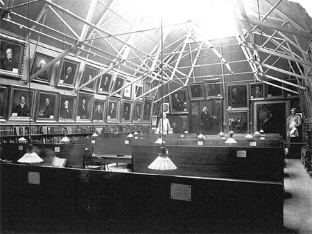
Wilson Hall was built as the college library and picture gallery. Its attic level, with iron trusses supporting a steeply-pitched roof, was designed for the display of paintings.

Wilson historic interior

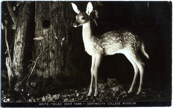
After the Butterfield Museum was demolished and Baker Library was built behind it, Wilson Hall became the home of the College Museum.

postcard showing deer in Wilson Hall

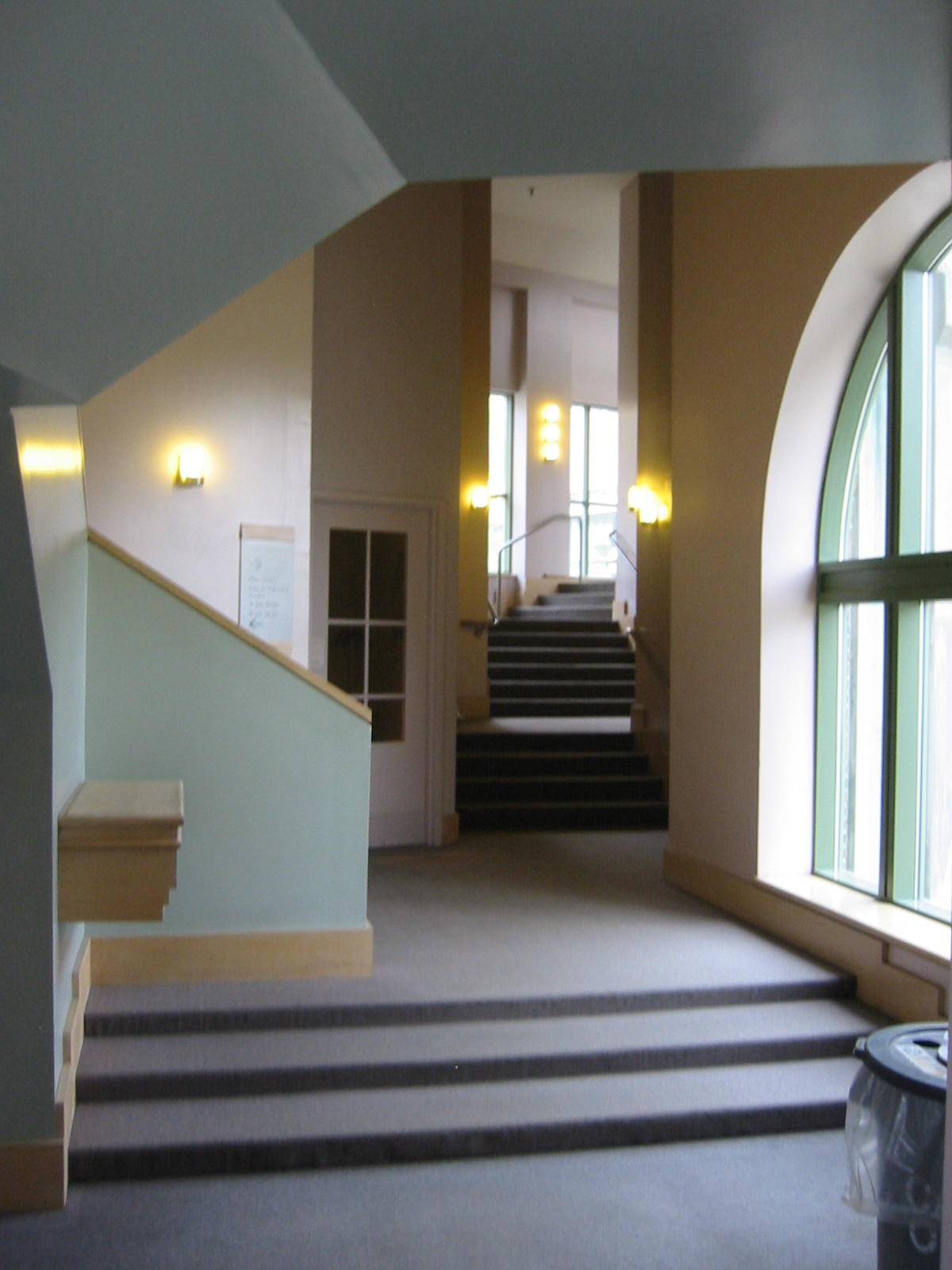
Charles Moore and the architects of Centerbrook placed their Hood Museum below Wilson Hall during the early 1980s, connecting the two buildings with a whimsically-busy enclosed staircase. The firm also renovated Wilson itself for the use of the Film and Television Studies Department.

photo of interior of Wilson Hall connector to Hood

Interior of Charles Moore’s Wilson connector, view to south, May 2006

The main entrance to the Hood, of course, was hidden from the view of passers-by. Visitors have to pass through the gate and walk up a broad ramp off to the side.

Now Centerbrook proposes to demolish (presumably) the Wilson connector and replace it with a new three-level addition. New galleries, offices, and classrooms could then go into Wilson and the addition, and Wilson’s presently shadowy entry arch could become the entrance to the whole museum complex:

With some improvements for access to the handicapped, Wilson Hall’s front door will become the Hood Museum’s new principal entry and be transformed by large glass windows to convey transparency and engage passersby on the busy campus green.

Although the large glass windows are a bit worrisome, the overall plan sounds like an excellent one. Will the Hood’s original ramp-entrance remain, or will it too be altered?

——

[Update 04.05.2012: Wilson portrait gallery image added.]

Framing the Visual Arts Center

Steelworkers topped off the frame for the Visual Arts Center on June 22 (Boston/SF News). (Still no updates on the Machado & Silvetti site.)

Visual Arts Center

VAC southwest corner (photos taken 06.21.2011)

The whole thing is shaping up just as Jeff Stikeman‘s renderings predicted.

Visual Arts Center

What does not come across in the close-up rendering of the Hood vista is just how important that newly-exposed view is to Currier Street (formerly South College Street):

View of Hood from Currier Street

Machado & Silvetti revise Arts Center design

New renderings of the Visual Arts Center have appeared on the Project Page. Where an early page by the firm stated an area of 80,000 square feet, and articles accompanying the initial renderings pegged the building at 96,500 to 99,500 square feet, the “revised program analysis,” surprisingly, identified a need for more area rather than less: it’s now at 105,000 square feet.

The November renderings show a building that seems to have the same basic form and numbers of bays as before. The renderings include plans for the first time. The idea of ground-level retail does not seem to have survived, but the artist-in-residence gets a fantastic perch in the lantern above the campus-side entrance.

Elevation drawings also emerge for the first time, along with contextual views from Lebanon Street and a site plan and photo of a model showing the plaza framed by Spaulding.

There are also images of a sectional model of the arts forum, which is the atrium close to the Lebanon Street entrance, and other views.

This building should look expensive.

[Update 01.10.2009: Two watercolors by Jeff Stikeman have been added.]

Past and future of the Heating Plant

Engineer Richard D. Kimball and his firm helped design Dartmouth’s Heating Plant and original network of steam pipes in the mid-1890s. It turns out that RDK Engineers is still around and claims that its project at Dartmouth was the first underground steam distribution system in the country.

The 2001 Arts Center Infrastructure Analysis (pdf) by Rogers Marvel with Ove Arup suggests that the heat plant eventually move to Dewey Field, north of the Medical School. That would allow the Hood Museum or other arts functions to take over the old plant building.

Inuksuk on McNutt’s lawn

Artist Peter Irniq (Wikipedia) erected an inuksuk (Wikipedia) on McNutt’s lawn for the Hood Museum (Dartmouth Life; Hood News).

His coat of arms features an inuksuk.

(The Hood has been busy lately, also acquiring, at Sotheby’s, Pompeo Batoni’s 1756 portrait of William Legge, the second earl of Dartmouth.)

—–

[Update 08.12.2017: Arms image and Wikipedia link removed, replaced with Canadian Bureau of Heraldry link.]

[Update 01.13.2013: Broken link to arms replaced.]