I. A recent one-paragraph review.
One alum quoted in the Alumni Council’s annual report (pdf) stated:
The north campus is appalling. The buildings look like something from USC and it is barren of trees. Further, the buildings pointlessly drift off to the right, making it an unsatisfying prospect. Seriously, from Berry north they need to plant several thousand trees to soften and obscure this severe, inappropriate landscape.
There is something worth discussing here. The unusual wording itself creates a number of questions:
-
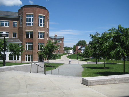
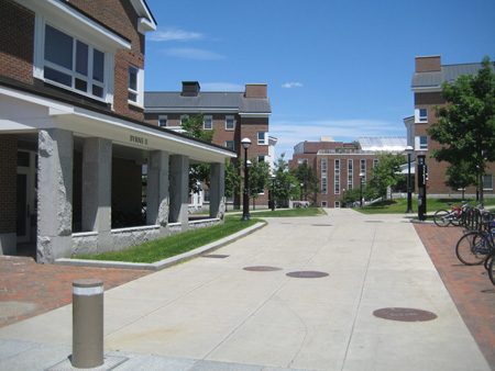
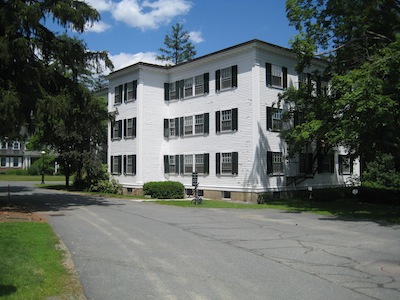
What does “north campus” mean? Is it the area around Kemeny, the stretch from Berry to Moore, or the stretch all the way up to Gilman? The word “severe” in reference to the landscape suggests that he* is referring to the Kemeny area, which has low granite walls. But who knows?
-
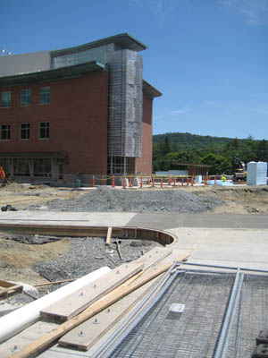
How quickly are trees supposed to grow? Berry Row was recently a construction site. One supposes the same trees are to a) provide general natural beauty (“The north campus is barren of trees”) and b) obscure a landscape.
-
The buildings drift “pointlessly” to the right: does this mean that the buildings fail to lead to a point, such as the still-unbuilt terminus of the Berry Row axis, or does it mean that the alignment of the row should follow an unbending north-south line no matter what goes on in the surrounding streets? It is obvious that the curve in the line of buildings traces of the historic curve in the town’s street grid, which in turn follows the bend in the river.
-
Is the USC comparison useful? The rather attractive buildings of USC do not look similar to the buildings of Berry Row and do not seem to have been designed by Moore’s firm, unlike, say, certain buildings of UCLA, UCSB (Kresge College, 1971), UCSC, and Berkeley (Haas School of Business, 1995).
II. Another take.
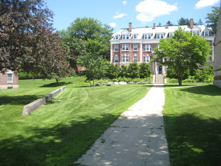
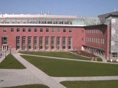
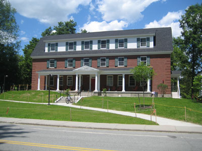
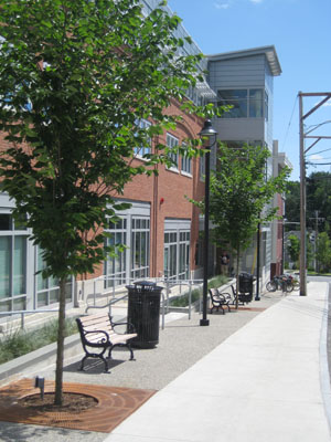
Kemeny/Haldeman seems successful. The building’s street facade is admirably modest in scale; the twin porticos are delightful. The way the building works with Sherman to bracket Carson Hall is important and it seems well done. The towers on the inside of the block are not as notable as they could be and disappoint somewhat. The handling of the termination of the main tower’s north facade might be a mistake: it is not much of a tower if it does not even meet the ridge of the roof.

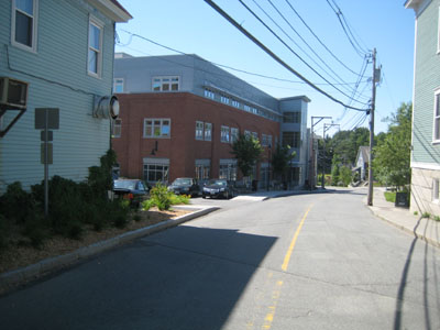
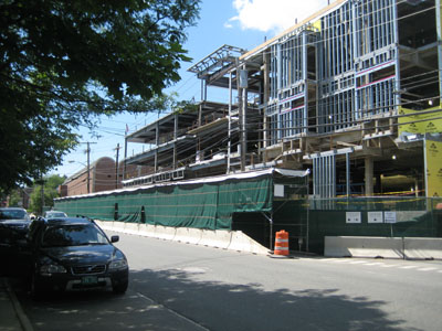
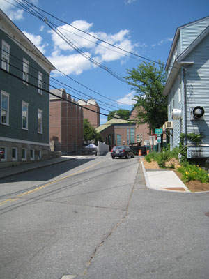
Berry Row, view to north
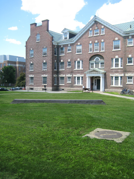
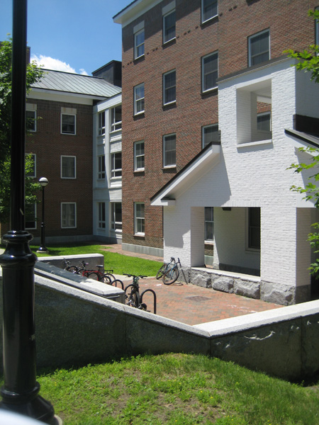
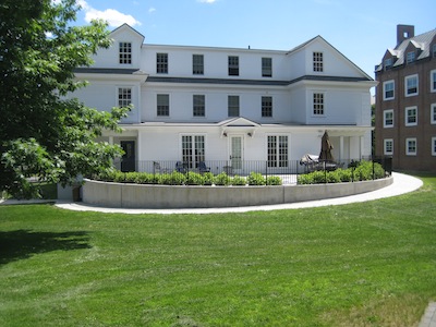
The eccentric footprint of the McLaughlin Cluster has the potential to be too quirky for its own good, but it works; the apparently arbitrary inflection is not bothersome.

McLaughlin Cluster, view north to Gilman
A brochure-quality view of McLaughlin captured by Google Street View looks to the south toward the towers of Sudikoff and Baker. The use of granite and white-painted brick, reminiscent of Dartmouth Hall, is appealing.
 Bildner Hall, rear entrance
Street View has a photo of the hefty sculptural light-pier at Bildner’s front entrance.
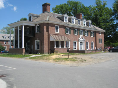
The absence of shutters on McLaughlin is a bit of a let-down, but shutters seem to be the litmus test for traditionalism in Dartmouth buildings these days: Fahey-McLane was meant to be shutterless but got them anyway, according to one account, because they were important to a donor.
—————–
* Really a “he”? He seems to be under 40 (the youthful use of “seriously”) but might view himself as having the tastes of someone over 60 (the use of the antiquated “prospect” instead of “view”).
—–
[Update 11.17.2012: Broken link to Alumni Council pdf fixed.]
