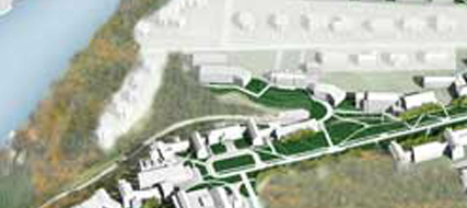
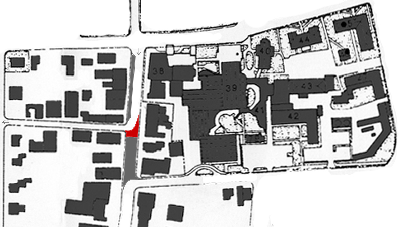
The conceptual design by ORW, which won a design award from Vital Communities, shows a redesign and replacement of a group of features in front of the Hop: the pedestrian crossing, bus loading area, bus shelter, empty grass rectangle, etc. It will be a partly-federally funded Town project built on College land by an architect chosen by the College. Even though the original timeline aimed to finish the work in 2013 (Request for Qualifications pdf), it was not built then, but it looks like it was in design last fall (UVLSRPC minutes) and is out for bids now (Construction Data Company).

Everything in the proposal is sensitive and unobtrusive, but one should note that this project will affect the appearance of the Hopkins Center. (In fact this will be one piece in the great parade of architectural interventions in the south side of the Green of 2012 through 2020.) During the warmer months, a dense block of trees here would hide several parts of the Hop, setting up the Moore Theatre as an independent pavilion — not necessarily a bad thing, and perhaps a good stopgap until we receive a full and true Hop addition, one that brings the building right up to the street.
Paving
The Site Plan Concept by ORW (pdf page 4) is impressive. The most noticeable change might be the grove of trees. With a pea-gravel floor, this outdoor room screened by two ranks of trees arranged formally on axis with Wilson’s entrance (and a realigned set of Hop plaza steps) will be novel and interesting and civilized. This allee could be exquisitely beautiful in the winter with snow on the bare limbs and the tables.
The street improvements (bulbs, insular pedestrian refuge near the site of the former grassy median) are all important. The crosswalk has a note indicating that it is aligned with an axial view of Baker Library. One proposal is pretty subtle: the use of plaza paving materials (concrete pavers, say) in place of asphalt in the bus/dropoff zone. This is crucially important in reducing the perceived width of the street: Hanover is not that big, and it doesn’t need a five-lane street below the Green. Here’s hoping the paving proposal is realized. (Even if not, the plan will still remove the diagonal parking in front of the hop — good riddance.)
Maybe after this is built and enjoyed for a few years the Town will go further by raising the street level and bollarding off the plaza and the Green. The same thing should be done with the Inn’s porte-cochere and its garage ramp.
Pavilion
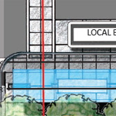
One neat detail is a bit hidden: a little visitor’s information pavilion. In the site plan on page 4 it’s obscured by trees but is described as measuring 12 x 15 feet. On page 5 its side is shown as if seen from Wilson Hall.
I imagine this pavilion helpfully blocking the wind in the winter but spending most of its time enclosing a few desultory racks of brochures for Quechee Gorge and Simon Pearce. It could replace the staffed, temporary kiosk that the Chamber of Commerce puts on the Green each summer [check]. But it could be much more: you can see its potential in the photo in the lower right part of page 3, the one showing the café tables and the menu board.
This pavilion could be a little coffee kiosk, a snack bar, or even a real bar, serving drinks out of a window. Not quite the Tavern on the Green or even the Out of Town News in Cambridge, but certainly at least as good as a sandwich kiosk in Bryant Park.
——–
