More observations about the final strategic master plan

The college released the final (November 2020) version of the master plan (pdf) in July of 2021 (Anna Merriman, “Dartmouth master plan calls for growth along Lyme Road,” Valley News (2 July 2021)). The plan is not getting enough press or enough praise, so here are some observations:

  • As noted earlier, the possibilities for growth in the central campus look great (page 38).

  • The north end opportunity sites are all super. Old Hospital Quad will be an incredible space 130 years in the making (pages 42-43). Fairchild Tower always did seem more than necessary for its purpose; it is really a signpost building (pages 44-45).

  • Putting student housing in Remsen-Vail might be touchy. If you wanted to reuse a dull Sixties building as housing, you should have done it with the DHMC tower. Remsen-Vail could be appropriately used for academic purposes, however (page 44).

  • Lyme Road development is inevitable, but it is not clear how realistic it is to show such development without parking lots (pages 46-47).

  • When it comes to the West End, the novelty in this plan is the meander of the Cemetery Bridge (Thayer Viaduct). It is more like a boardwalk on a nature trail and does not appear to be a suspension bridge at all — but won’t it be extremely difficult to put bridge footings in a cemetery? (Pages 48-49).

  • More on the West End: Again, the original Tuck School building here could make an amazing undergraduate dormitory, but one would hate to see Tuck School vanish into the suburbs (pages 48-49).

  • South End and Downtown: The athletics promenade between Lebanon St. and Thompson Arena is excellent and long overdue. It could be a fine linear work of landscape architecture. Annexing Davis Varsity House as a part of the “house community” for the Crosby Street swing space dorm could be a superb move. The reasoning behind the focus on wellness for an expanded McKenzie is not clear — couldn’t it be used for anything, including arts uses? — but it makes no difference as long as the building is saved. McKenzie might present a real opportunity to create a new building within the historic brick walls (pages 52-53).

  • Quibbles are minor and basically the same as before: Thayer School didn’t go from the old Experiment Station directly to the West End in 1939, it spent several years in Bissell Gymnasium (page 9); the reference to “Dart Hall” is kind of irritating (page 38); and it’s “Bema” not BEMA (page 41).

  • The map on pages 28 and 29 showing named landscape opportunities is an important document. Some offhand proposals for these spaces:

    Name in Plan Proposed Replacement
    Riverfront Park Leydard Park
    West End Green A tough one; this was the Wigwam Circle postwar housing area.
    Tuck Green at the end of Tuck Mall Tuck Circle
    Dart Row Commons Fayer Green? “Commons” is not really appropriate for an open space.
    Maynard Yard Old Hospital Yard. This really is a better name.
    Life Sciences Lawn Another tough one; there is very little historic context here.
    North End Green in a strip of Dewey Field Dewey Field. Another one that really is a better name.
    Vox Lane NHCAMA; New Hampshire something; or State College something? “Vox Lane” has always been arbitrary, which is disappointing in this richly historic precinct.
    Park Street Gateway Piazza Nervi. This is tougher to justify now that grass rather than hardscape is proposed for this space.
250th anniversary planning heats up

  • One might be surprised at paucity of info out there on the demolition of a part of the Hood Museum and the construction of a large addition. The D has a demolition photo from the Green taken last fall. Curbed.com has a post with two post-demolition photos. (See also the set of fascinating photos of the architectural model at Radii Inc.)

  • Metropolis does have a story on the Hood. These are excerpts:

    Dartmouth first began seriously mulling over the Hood’s fate in 2001, when it commissioned a speculative study by Rogers Marvel Architects. In 2005, it commissioned another by Machado Silvetti, the architectural firm that designed the Hood’s newest neighbor, the Black Family Visual Arts Center. Then in 2010, it commissioned yet another study, this time by Centerbrook, the practice that Charles Moore cofounded afterparticipatory process, which put users on a level playing field Moore Grover Harper. None created the visual presence — that new front door — that Dartmouth administrators were looking for.

    The college began soliciting proposals from a broader pool of architects. A selection committee, including faculty and administrators, winnowed down a short list. In the end, four architects were selected to be interviewed. John Scherding, director of campus design and construction, vividly remembers the TWBTA proposal:

    “All of us in the room felt it was brilliant. They were the only firm that suggested disconnecting the Hood from Wilson Hall, allowing Wilson to stand proudly on the corner of the Green. They were the only firm that showed a strong identifiable front entrance to the building, infilled the courtyard to provide program space, and really strengthened the north-south axis. It was a very powerful and simple concept that satisfied all of the needs.”

    It thoughtfully preserves the gallery spaces (one exemplary detail: To preserve the windows along the staircase, and the dance of light along the walls, TWBTA will convert some of the windows into light boxes of stained glass) and will likely improve the museum experience in many fundamental ways.

  • The sestercentennial celebration website is up. The wordmark makes some interesting typeface choices. The unique “250,” which is set in a type that might be based on Bodoni, includes the most arresting element: a numeral “2” whose diagonal (neck?) is partially erased. The numeral “5” is partially hidden by the “2,” but there is no explanation for the missing bit of the “2.” Is it meant to look like the imperfect printing of an eighteenth-century pamphlet? It looks a bit like a stencil. In any case, the “Dartmouth” on the second line is set in the official Bembo (standard Bembo, not the Yale-only version), and the third line (“1769-2019”) is set in a sans serif font.

  • The sestercentennial will involve a year-long program of events (President’s message) created by a planning committee seeking to meet a number of goals.

  • Here’s a clever little film about an interesting story: Goudy & Syracuse: The Tale of a Typeface Found.

  • Interesting insignia decisions here: the midcentury Institute of International Studies in California was acquired a few years ago by Middlebury College (Wikipedia). In 2015, Middlebury “introduced a brand identity system that embraces the full breadth of its educational endeavors by placing the Middlebury name on each of its schools and programs” (MIIS page). And what a varied collection of institutions it is, including summer schools, conferences, and academic programs. The unified identity is based on a shield. I don’t know about the Midd shield: the globe looks like it’s from a different design language, from a 1960s U.N. brochure. The chapel touches the top of the shield. The hills, because they meet the edges of the shield, read as the sleeves of a gown or as curtains. Maybe this is because the eaves of the chapel are shown as angled bars floating free on the clouds.

  • The Institute is the only Middlebury institution that gets a truly distinctive shield, a variation “that replaces the Green Mountains of Vermont and Old Chapel with the historic Segal Building from the Monterey campus and the year of the Institute’s founding” (MIIS page).

  • A Kickstarter project for Design Canada, “The first documentary chronicling the history of Canadian graphic design and how it shaped a nation and its people.”

  • The New Yorker has has an article on lines of desire. Speaking of unplanned paths, the aerial photo of the vacated pipeline protest camp in the New York Times is remarkable.

  • McGraw Bagnoli Architects have published a brochure about the firm that details the five urban design projects planned by William Rawn Associates during the early 2000s. This is fascinating. It will be interesting to see whether the school ever completes the Sargent Block project and what plan it follows.

  • Smith & Vansant have photos of some of the houses the firm has renovated for the college, including Unity House and Thayer Lodge, both on South Park Street, 26 East Wheelock, 19 South Park, and the Victorian professor’s house of the North Park House community.

  • Architect Vital Albuquerque (again, great name) < ahref="http://rwu.edu/academics/schools-colleges/saahp/portfolios/alumni/vital-albuquerque-class-01">presents more unreleased renderings of the unbuilt NCAC, including a remarkable photo of a model of the project.

  • Engelberth Construction has its page for the West Stand Replacement up.

  • At the last board meeting,

    Hanlon outlined goals to renovate a number of aging buildings, and the board approved funds to proceed with a schematic design for the renovation of Dana Hall, the former home of the biomedical library located at the north end of campus, to facilitate the expansion and improvement of faculty office spaces.

    The board also approved a capital budget of $30 million to fund a number of projects, including the Morton Hall renovation and planning and feasibility studies of the abatement and demolition of Gilman Hall; renovations to Reed Hall and Thornton Hall; and undergraduate housing expansion and renewal.

  • A Moosilauke update with photos by Eli Burakian. The building has an interesting mix of construction techniques. Some of those “character” timbers are fantastic.

  • Some of the photos of the federal building that houses the Ninth Circuit Court of Appeals, such as the one in this New York Times story from February 9, show the elaborate metal lanterns flanking the entrance of the 1905 building. The lanterns might be familiar: architect James Knox Taylor, then Supervising Architect of the Treasury, modeled them on the torch-holders of Palazzo Strozzi in Florence of 1489 (GSA page on the Browning U.S. Court of Appeals Building). The Strozzi torch-holders also inspired Charles Rich in his design for Parkhurst Hall (1913).

  • Drove past Nervi’s SCOPE arena in Norfolk, Va. (1971-72) last weekend and admired the ribs that form the roof of this entrance pavilion (Google Street View):

Armatures for development and a route for navigation

The Beyer Blinder Belle master plan is so far only publicly available in the form of this attractive image from the firm’s website. Since the firm put up the image, there has been no detailed discussion of what it means.

——–

Dartmouth, largely by happenstance, has ended up with a campus that is centered on a tower that marks the main entrance to the library. Three armatures radiate from the library. Although not exactly axes with termini, they are spines along which development is organized: the Green, Tuck Mall, and Berry Row. These three armatures are reinforced by the BBB master plan.

In addition, the plan (a) adds one small new armature; (b) extends existing armatures with new fingers in three places; and, where existing development prevents the laying out of a new armature, (c) creates a unified, singular walking route to tie together everything along the way.

The New Armature

The combination of construction on North Main and the replacement of the Choates creates an armature extending all the way from Berry Row to the Roth Center on Occom Ridge.

One appreciates the designers’ resistance to the impulse to demolish Cutter/Shabazz, but it looks as if the axis of this development could be brought into Berry Row a bit better. This is a sort of Baker Library situation, with the axes of Tuck Mall and the Green intersecting, and it might call for a tower or a gateway. One imagines a way to walk through the west wall of Berry Row, as Rocky gives access to Webster Avenue. It would be interesting to see a gateway knocked through the center of Cutter/Shabazz as well. There is a lot of potential here. (Cheering many hearts, the Choates are proposed for replacement in this plan; it is not clear that Choate House and North Hall have to go as well, though.)

The Fingers

1. One finger extends Tuck Mall along the Fahey-McLane (Tuck Drive) axis, tying in the President’s House and new construction on Webster Avenue. This is an axis established nearly a century ago but not pushed until recently. As noted earlier, the closing of Tuck Drive is aggressive but probably inevitable. It is not clear whether the President’s House would keep its current function, but building here, especially along Webster Avenue’s vacant lots, is a wise use of space.

2. One finger bends to extend Tuck Mall beyond Murdough down through Whittemore Circle. This is not particularly original either, and while it is good that the plan shows development here, it could certainly be less suburban and might benefit from organization around an axial pedestrian path rather than a curving automobile driveway.

3. One finger extends Berry Row beyond McLaughlin up to the LSC. This is the most original of the three. It confronts the problematic fact that the Med School axis is separate from and parallel to that of Berry Row. Rather than provide an emphatic terminus for Berry Row, the plan shows a curving amble around to the medical axis.

The Navigation Route

A green band runs from Wilson (at the southeast corner of the Green) all the way to Burnham Field and presumably the softball field or even the Appalachian Trail. It shows up on the plan neatly as the shortest path between the two points, wending its way past the Heating Plant, Memorial Field, Rolfe Field and Leverone Field House, and Thompson Arena.

A person could walk this way today, but the route leads through several parking lots and is not entirely pleasant, let alone marked or coherent. Creating the route as shown on the plan will require pedestrianizing the parking lots at the Heating Plant, the area behind the Gym (that one has always seemed impromptu and inappropriate), and at Thompson Arena.

Museum-like displays; a Hanover designer

The old idea of the trophy room for intercollegiate athletics seems to be shifting toward something closer to a museum, with text and graphics (reproductions of historic images, not originals) arranged to tell a story. Objects are displayed in support of the story rather than as the spoils of victory.

The Friends of Dartmouth Football Timeline, Video Archive Kiosk and Memorabilia Exhibit at Floren Varsity House is an example. Designed by the Hanover firm of Charles Gibson Design, the comprehensive display is the closest thing Dartmouth has to a permanent museum of any aspect of its own history. (I do not know what proportion of the old trophies are kept in Floren, in Davis Varsity House, or in the Oberlander Lounge in Alumni Gym.) Gibson also designed a timeline for hockey in two locations in Thompson Arena and a display recognizing donors John and Carla Manley.

During the Seventies and Eighties, Charles Gibson worked in the Hop’s Graphic Design Studio, and since then his firm has done a lot of work for the college and other area institutions. The firm revised the campus map (the next-to-latest iteration); created signage (including the mainframe-like kiosk that occupied the entrance of the old Kiewit); and paper plates and cups for the Courtyard Cafe in the Hop. The Nugget Theater’s freestanding marquee, influenced by the Classical porticos of Main Street, is another product. (By the way, doesn’t the little photo of the modest portico of the Hanover Post Office make that building look like a Great Work of Architecture?)

Most notably for our purposes, Charles Gibson Design did a Comprehensive Identity Program for Cardigan Mountain School, including a revision of the school’s seal that features a green shield containing a lone pine and open book. And if you are thinking about the “Dartmouth base,” the wavy lines of water in the base of the shield of each of Dartmouth’s schools, Gibson did a logo for the local school district in conjunction with the Banwell addition to Hanover High. For the country’s first interstate school district, drawing from both Hanover and Norwich, the circular logo presents the Ledyard Bridge above wavy water lines on a green field.

Incubator progress; other items

  • A nice Burakian aerial from above the Chase Field athletic complex in the foreground shows the potential of Piazza Nervi.
  • A little more on the NCAC: it was not noted before in reference to the Alex Atwood rendering that the building’s extensive underground space was to have had at least two skylights in aboveground lanterns, almost like Pei’s Pyramid at the Louvre.
  • More on Hillflint, the clothing company mentioned here in October, from Dartmouth Now. Turns out it was started by John Shi ’12.
  • The school’s Flickr photostream has a photo of the interior of Rauner showing some of the presidential portraits. I don’t recognize the background of President Kim’s portrait — a room in Baker, perhaps?
  • Outgoing Board Chair Steve Mandel did not mention any potential construction when he wrote:

    [T]he new living arrangements will embrace the concept of the “house system.” Students will live together not only in their freshman year but also in upper-class residence clusters for their three remaining years. Investments in academic programming and affiliated faculty are planned to foster community in these residential clusters… These changes should reintroduce a dorm-based sense of identity for undergraduates.1Letter from Chairmain of the Board of Trustees Steve Mandel (21 March 2014).

  • The Big Green Alert Blog dissects the seating figures for the new West Stands with reference to an article on the project in The D. It looks like the replacement stands will cost 2,312 seats. For reference, the current capacity of all of the stands at Memorial Field in total is about 13,000.
  • The D also writes on a planned expansion of the enrollment, faculty, and curriculum of Thayer School. No word yet on new buildings, but they seem inevitable, especially on the parking lot south of the McLean ESC.
  • An Incubator progress photo has been posted by Dartmouth Entrepreneurial Network. Four Currier does seem a great place for it — downtown, in a commercial building, and yet on college property right next to campus. NHBR article notes the hiring of director Jamie Coughlin from the abi Innovation Hub in Manchester. An article in BusinessNH Magazine paraphrases Coughlin:

    He says the new 3,000-square-foot space is designed like the abi with open collaboration in mind, to host residencies for entrepreneurs, and help connect students with executives, faculty, and investors.

  • Did you know that the Dartmouth Entrepreneurial Network has a residential program?
  • DHMC News announces the receipt of a gift to fund the construction of a substantial hospice care center. The hospital is still looking for a site.
  • And DHMC has received the Legacy Project Award from the American College of Healthcare Architects. The press release states:

    Dartmouth-Hitchcock represents a paradigm shift in hospital design, incorporating and foretelling some of the most significant healthcare delivery and design issues of the past 25 years. This includes: […] A mall as the organizing concept and circulation backbone.

    Architects SBRA have a nice bibliography (pdf) of articles about the hospital.

—————————————-

References
1 Letter from Chairmain of the Board of Trustees Steve Mandel (21 March 2014).

Inn updates, the story of Bean’s Art Store, and other notes

  • The Dartmouth has a story on Bean’s Art Store, the little shop near the Hop (behind Ledyard National Bank) that has been furnishing Studio Art students with their squishy erasers and tubes of paint for decades.
  • Dartbeat has a post with photos on the progress at the Visual Arts Center. Big Green Alert Blog notes that the power lines along Lebanon Street are going under ground.
  • The Boston Globe links to a Valley News story on the completion of a large part of the Inn renovations (see also Dartmouth Now. The Rauner Library Blog has a post on the Inn’s predecessors on the site.
  • The Christian Science Monitor reports that the Interior Department has designated the Connecticut River and its watershed the first National Blueway in the country. The Valley News reports on the septennial perambulation of the riverine New Hampshire-Vermont border by the two states’ attorneys general.
  • The Valley News reports (again) that the Friends of Hanover Crew now have permission to build a rowing dock at Wilson’s Landing, a part of Fullington Farm. Hanover’s crews plan to move their boats out of Dartmouth’s boathouse and into a new boathouse to be built at the farm. An interesting report (pdf) from Engineering Ventures mentions that when the Friends of Hanover Crew bought their 2.4-acre portion of the farm from Dartmouth in 2008, they promised to allow Ledyard Canoe Club members to store 20 canoes and kayaks on the site, probably in the basement of the existing barn.

  • Dartmouth Sports announced some time ago that the new basketball office suite was completed in the old Kresge gym space in Berry Sports Center (via Dartmouth Now).
  • Thanks to Bruce for his proposal that as part of a Piazza Nervi project, the entrance to Thompson Arena should be redone (Big Green Alert Blog). This is a good idea, since Thompson’s entrance definitely needs replacing. But while one does notice that Thompson’s front facade is not parallel to Leverone’s, the lack of alignment is not necessarily a problem: plenty of urban spaces, especially in Italy, lack any right angles at all. And if the facades were made parallel, the difference in heights might become more noticeable. Who knows… The 2000 student life master plan (pdf) notes that the entry into Thompson Arena is obscured by existing houses along Park Street:

    There are, however, opportunities to reinforce the entry to Thompson Arena by moving or demolishing the College-owned houses on Park Street in front of the current entry. Doing so would relate the Arena to its cousin, Leverone Field House, both designed by Pier Luigi Nervi, and complete an intention planned but never realized.

  • The school’s Flickr page has a photo set showing the new ’53 Commons renovation of Thayer Dining Hall. The photos, along with plans, show that the red awnings in the main dining room have been removed and the bays opened up to allow free passage from north to south. Upstairs is where the real changes have taken place: there are lots of dining rooms up there now. The long, narrow Topside space is a dining room; the space above the leather-paneled Tindle Lounge/Paganucci Room is a private dining room; the spaces above the lobby (formerly offices?) look to be dining or meeting rooms. It is not clear where they put all the DDS offices that used to occupy the second level. At least some of the quadripylons out front were removed for the project (Street View): will they be replaced? Some kind of bollard seems necessary there, but the area might be more interesting with a different solution.
  • The 1994-era Lone Pine Tavern in the basement of Collis has been replaced by something called One Wheelock. It seems that a change in focus was needed, but did the room really have to be stripped bare? Perhaps people were stealing the memorabilia.
  • The Rauner Library blog has had too many interesting posts to count. See posts on the mathematics funerals and duckboards on the Green.
  • Dartmouth Health Connect opened a while back (The Dartmouth). It occupies the former Omer & Bob’s location following a renovation by Haynes & Garthwaite. It turns out that H&G designed Omer & Bob’s new location in Lebanon.
  • Lebanon is selling its Junior High School building, designed by Jens Larson (Valley News, Valley News). Note the similarities to Baker Library:


  • Some interesting things going on at other colleges: Yale is building a freestanding college in Singapore, designed by KieranTimberlake (Times article on the controversy). The University of Virginia is building a facility for its squash team at the Boar’s Head Sports Club, part of a fancy private resort (UVaToday). The Boar’s Head Inn is owned by the U.Va. Real Estate Foundation.
  • That Hanover war memorial that stands in front of the Town Building on Main Street? (Street View.) It was previously associated with the Green, where one would expect a war memorial, and shows up in front of the Inn in an old photo that was published in a recent story in the Mirror. It is interesting to note that a nearby space, just to the east of the Inn, later became a war memorial garden for the college.
  • “Chaste” might not be the right word, but “tasteful” is close: TruexCullins’ Buchanan Hall addition is very nice (Street View, school project page).
  • The Rauner Blog’s post on the Ski Jump features this photo of the jump’s outrun. The jump is gone now, but the Golf Course remains. Does that view show the same site as this one, from the Hanover Country Club’s map of the various holes? More historic images of the jump at Skisprungschanzen.com (via Big Green Alert Blog).
  • More information on the bypass mentioned here earlier, from page 14 of the 2002 Campus Master Plan (pdf):

    To reduce congestion, Hanover has explored alternatives to bypass the Inn corner. A Connector Highway linking Route 120, Route 10 and I-91 would be very desirable for both Hanover and the Medical Center, but Lebanon has not supported this proposal. The College should continue to study this and other by-pass proposals, making College properties available if necessary.

Piazza Nervi

I. Background

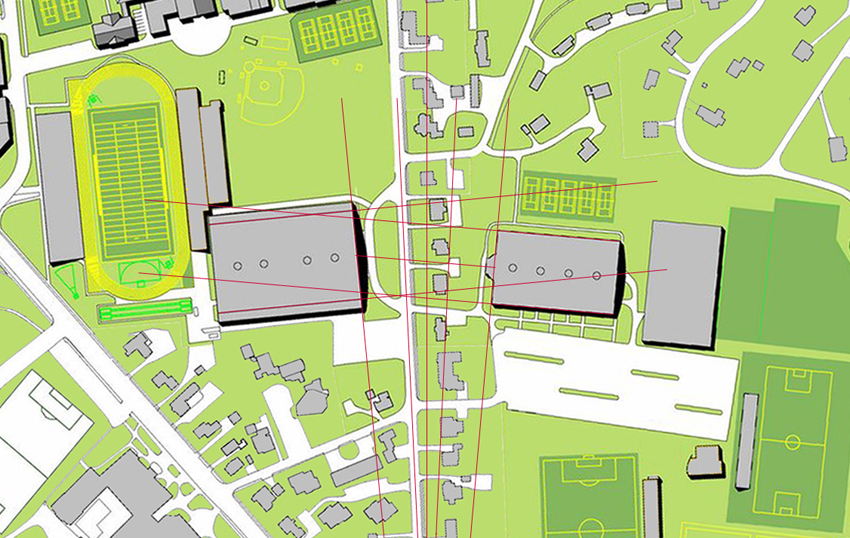
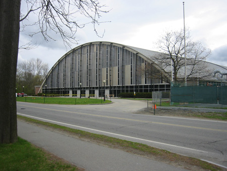
The site where Leverone Field House and Thompson Arena face each other across South Park Street, with a couple of houses in between, is an interesting one (Google Maps aerial, aerial, street view entering from the south). It is getting some attention these days.

Leverone forecourt

Leverone Field House forecourt in June 2005

First, the transit report proposes a bus shelter here (pdf).

Second, Athletic Director Harry Sheehy commented in an interview in the Alumni Magazine that the school needs another field house. Chase Fields seems a likely site, and the building could even take over a part of the Thompson parking lot facing South Park Street.

Third, the owner of the private house just below the entrance to the parking lot, at 31 1/2 South Park Street, has demolished the building and is replacing it with a three-story building containing a dental office with apartments above (Planning Board minutes Sept. 13 (pdf); see also Planning Board minutes Sept. 6 (pdf)).

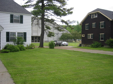
All of this activity gets one thinking about the two old houses in front of Thompson Arena at 25 and 27 South Park Street, both designed by Jens F. Larson.

Thompson Arena forecourt in June 2005

Thompson Arena forecourt in June 2005 showing 25 and 27 South Park

On the one hand, the presence of the two houses preserves the historic appearance of the east side of the street and maintains the rhythm of solids and voids that stretches all the way up to Wheelock Street. Number 29, the Fire & Skoal house, is also a Larson product.

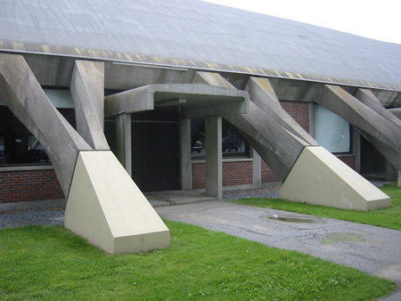
The view that the houses frame is interesting and surprising — it looks like there is some kind of hangar back there, and a walk along the beach-flat ground that reveals the ribs and upturned hulk of Thompson behind the brown shingled house can create a nautical impression. Removing the houses to create a plaza would be a bit arbitrary: very few people actually walk from the front door of Leverone to the front door of Thompson.

site plan

Site plan

On the other hand, the two Nervi buildings were meant to face each other, and the two houses have always been meant to come out. Master plans have long proposed that the houses be removed and a plaza be constructed to link the two concrete arenas. The 2007 Landscape Master Plan included such a proposal (pdf). The 2000 student life master plan (pdf) notes that the entry into Thompson Arena is obscured by existing houses along Park Street:

There are, however, opportunities to reinforce the entry to Thompson Arena by moving or demolishing the College-owned houses on Park Street in front of the current entry. Doing so would relate the Arena to its cousin, Leverone Field House, both designed by Pier Luigi Nervi, and complete an intention planned but never realized.

II. Proposal

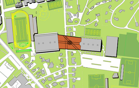
The two Larson houses at 25 and 27 could be moved across the street, above Cobra, and a plaza could be built in their place.

proposed site plan

Proposal

The plaza would be difficult to make uniform in footprint. The two Nervi buildings do not face each other directly. Each stands a different distance from the street and rises to a different height.

Piazza Nervi would become the student entrance to the whole Chase Fields complex. Pedestrians walking down Park Street would swing diagonally across the Thompson forecourt and then head eastward. The present route into the parking lot is relatively convoluted and disappointing.

As a bonus, the piazza could tie into a new path cut westward through the Crosby-Park block. The need for this path to Lebanon Street, the only cross-block route between Wheelock and Summer Streets, has been obvious for years, and the Ped/Bike Master Plan released in October (pdf) recommends it. A long brick wall built to shield the neighbors’ houses could serve as a venue for a horizontal climbing race put on by the DOC: speed-bouldering.

III. Conclusion

The new piazza would be the first work of architecture of any kind in Hanover — whether a plaque, monument, room, or building — dedicated to an architect.

It would make a nice gateway for drivers entering the campus from the southeast. That might be its most important function.

The danger is that Piazza Nervi would be a windswept Modernist wasteland: there is a fine line between minimalism and barrenness. But something good is possible.

Thompson detail

Thompson Arena side entrance in June 2005

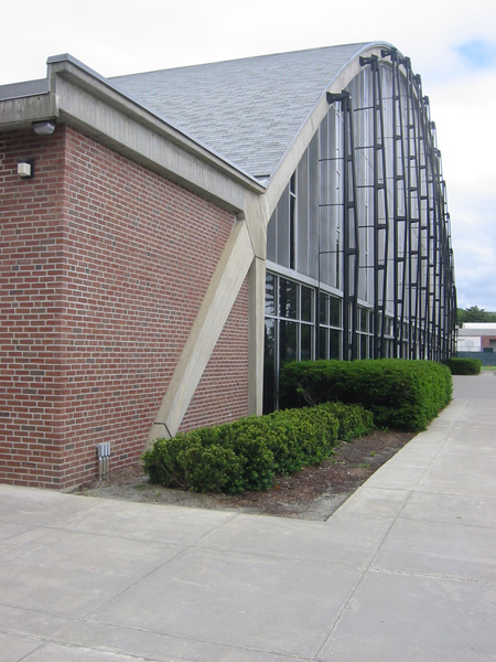
Leverone front facade

Leverone Field House front facade in June 2005

—–

[Update 11.17.2012: Broken link to oblique image fixed.]

[Update 06.10.2012: Link to and quote from 2000 master plan added. Thanks to Big Green Alert: The Blog for the link here and ideas.]