The master plan: initial impressions

See the latest version of Planning for Possibilities on the Presentations and Outcomes page. So far, the October 2020 draft plan and a slide deck have been posted.

The new master plan is very impressive.

The scope of the plan is impressive. It is the first master plan for the college to at least account for all college properties (the map on page 5 is zoomed out so far that it shows part of Canada) and the first plan to frame the campus in a regional context. Especially where transit is concerned, the Organic Farm and DHMC really do need to appear on the same map.

The document is more readable and less technical than its predecessors. Its creators made the interesting decision to use oblique aerial views exclusively — meaning that none of the proposals for development appear as flat “plans.”

The potential projects on campus look excellent. Placing a building on the lawn of Shabazz Hall makes so much sense. The natural site for a new physical sciences building beyond Burke of course requires yet another demolition of Dragon. The proposals for Bartlett and Wheeler additions are fantastic, with the latter being particularly bold. The natural row behind Mass Row could incorporate an abutment of, or at least an entry plaza for, the Cemetery Bridge at its south end. The Bema pavilion makes sense (maybe the place will see more use if it has a proper covered stage?), though erecting a frame building would be unusual in that space.

One might wish the planners had considered building on the vacant lots in front of Sanborn and south of Blunt as well. And why not show a building site on Berry Row between Kemeny and Moore? It has always been planned that way, even going back to VSBA days after the purchase of the hospital property. Oh well. (The plan also does not clearly note the anticipated Ledyard Canoe Club replacement, but that is not important.)

Here’s hoping that the college preserves the old frame buildings that are now standing on the various development sites. There are two buildings on the site behind Mass Row, two on the Choate Road corner, two in front of Thompson, and two on College Street next to Sudikoff. There is also a certain amount of appeal to the idea of saving Sudikoff itself, the village-like assemblage of brick house-forms, and of saving Raven, but neither building is of a scale to stand up to Moore Hall next door. Clearing the Sudikoff corner is the breaking of eggs to make an omelet in this plan.

The big question: Hilton Field (the western portion of the golf course)

The plan proposes that the oldest portion of the shuttered golf course be turned into an arboretum. This is a clever choice, especially given the neighborhood and its sensitivities. An arboretum really is typologically and functionally similar to a golf course or, for that matter, a city park or a cemetery. In the end, this minor change in use might amount to nothing more than ceding the land to nature as at the adjacent (and intermingled!) Pine Park. And yet an arboretum will not take Hilton Field off the table for some distant future development if it is needed. Still, the college would probably be remiss not to put a half-dozen houses for sale to faculty along Hilton Field Road at the same time it lays out the arboretum. What an opportunity!

East and North of the Green

The Thel sculpture is not mentioned, but it might be endangered:

Fairchild Field
A new shared surface for cars, pedestrians, and bikes, in lieu of a vehicular access road, creates better pedestrian connections between the Physical Sciences Complex and the Historic Core.

Anything that replaces the access road would be an improvement.

The plan devotes a great deal of attention to Fairchild Tower. It proposes a new interior stair and a bridge (to Wilder, presumably). Fairchild has always seemed a chilly, hollow signpost, but the illustrations in the plan remind us of how stylish it is.

Moving south across Wheelock Street, the big Vox Lane redevelopment image shows McKenzie and the Store House as not only preserved but expanded vertically into a “wellness” building — fantastic. That will be one of the most architecturally interesting buildings on campus. (This proposal was not included in an August presentation image and thus seems to be a recent inspiration.)

South of the Store House is shown a parking garage on the FO&M corner. Fine, but one hopes that it will have retail uses on the ground level. It could make for a neat visitor entry to campus: you drive to town, park in the garage, follow the signs to the back door of Wilson Hall — the new admissions office, in this plan — and when you embark on your campus tour and pass through Wilson’s great arch you see the Green laid out before you.

It is good to see the athletics promenade alongside Leverone (page 52). And Piazza Nervi is on the map, described this way:

Park St Gateway
A gracious gateway to athletics and the campus visually connects the Leverone Fieldhouse and Thompson Arena, both historic modernist structures designed by Pier Luigi Nervi.

That “gateway” project would move the two houses currently blocking the view of Thompson Arena and, interestingly, would add a roadway in front of Thompson. Clever: lining a lawn with streets sets it off as a public space, a public green.

North Campus

The architects’ image of a Maynard Street Green on page 45 looks like a Currier and Ives print.

The plan mentions the possibility of moving all existing uses out of the Rope Ferry Road buildings and turning the buildings into graduate dorms. Interesting! But wait, do they mean vacating Dick’s House too? They do, apparently — which would be too bad. Would there be any infirmary on campus, or have student health services become a collection of vending machines? Presumably the infirmary would go to the “wellness” building at McKenzie. If that is what it takes to save McKenzie, then so be it.

And beyond: Land banks on Lyme Road

The new buildings north of the Class of 1978 Life Sciences Center are a great start, and there could be many more here. Dewey Lot has so much space, as stated in the report, and so much potential. The depression here creates a fantastic opportunity for an extensive below-grade parking deck. As stated on this site in the past, however, the functions placed here should not be college-related. This is no more a part of the campus than is the CVS (Grand Union) building, and college ownership of this site does not change that fact.

Moving up along Lyme Road outside of town: The two alternative land bank locations labeled “Site 1” will inevitably be suburban and oriented to Lyme Road, notwithstanding the plan’s idealism about self-driving cars. They really will have parking lots, because they will become office parks and convenience stores. As far as the choice between near and far, the farther site, next to the fire station, seems preferable. There is less chance that it will contain anything that undergraduates would need to visit.

More on the two locations of Geisel, the Grand Limited-Access Road, and the rest of the plan in a future post.
Hood expansion images published

Last week, writes Dartmouth Now, the board:

approved a capital budget of $83 million to fund a number of projects, including strategic investment in shaping Geisel’s future, and renovations of the Hood Museum of Art and the Moosilauke Ravine Lodge.

The Hood info is finally up at the TWBTA site. Ignore the thumbnail images and view the slideshow, which includes floor plans and larger images. The site plan indicates that the landscape design is by Hargreaves Associates. The expansion video at the Hood’s website give a glimpse of an interesting architectural model.

The lobby image at the firm’s site not only shows the palette of the spare space (a cool vitreous? gray brick on the outer walls, granite or other stone floor, and white plane ceiling) but gives a glimpse into the old museum — the far wall is the partly-covered, partly-revealed exterior of Hood at its dramatic stair.

The firm’s site describes this space:

An atrium above the flexible lobby space connects the museum and Bernstein Center, creating an open, accessible space for the entire Dartmouth community. Active and filled with light, it can be used for installation art, performances, and digital programming while simultaneously providing a place for students to study and learn.

This is the Google Street View of this future lobby space. It is a pity the super po-mo concrete window surrounds can’t be preserved, though.

Two interesting little restoration projects could be part of this expansion. One is the south end of Wilson, where the connection is being severed. Similar infill is depicted in the east side of the Hop where the connections — the iconic gateway and bridge — are being removed. The images give little idea of whether the goal will be to match the existing historic fabric, or do a simple fix, or make the new work stand out from the old.

A Hood expansion design released

On the heels of the unfortunate news (Culturegrrl, Dartblog) that Michael Taylor has left the directorship of the Hood Museum, a few details regarding the expansion of the museum have surfaced.

So far, the only image officially released has been the one distant view of a white box projecting into the museum’s first courtyard. What about Charles Moore’s famous arch?

Although the white box leaves a gap alongside the Hop, it does appear to demolish the arch. This seems a bit of a shame; was there no way to enclose part of the iconic arch as a fragment?

The expansion seems humorless, especially in comparison to Moore’s quirky work; the project now seems focused on geometric purity. In replacing the intentionally retiring presence that is created by the Hood’s recessed siting and netlike form, the white box is giving the Hood a do-over. This is what should have been done in the first place, it is suggested: not an infill skein but a proud, freestanding building.

———–

[Update 04.16.2015: Links, image, and information removed at request of author.]

[Update 03.22.2015: Links to Centerbrook study and Wikimedia image added.]

A black hole telescope; other news

  • An earlier post here expressed concern about the plaque added to the Orozco Room after the National Historic Landmark listing. Dartmouth Digital Orozco depicts the plaque, a very dense text panel, on what it calls the “National Historic Landmark Pillar” near the center of the room. The other pillar is labeled “Manton Pillar” and bears the nice stone plaque created earlier.

  • CRREL site manager Larry Danyluk, paraphrased in the minutes of a Planning Board meeting:

    Expansions planned include another wing of offices, a new cold room and, in partnership with the Smithsonian, a radio telescope for black hole research. The telescope will be installed for 2-3 years, then moved to Greenland. Ten to twelve people will be added to staff the telescope project.1Planning Board, minutes of meeting (4 June 2014), pdf, 5.

  • The Dartmouth has an article on student-made graffiti, murals, and decorative painting in society buildings.

  • The renovation of Home 37 by ADD Inc. as the temporary location of Dana library gets a mention in Architect, the AIA magazine. ADD Inc. is the firm of Fred Kramer ’77 (DAM class notes).

  • Kresge Library is turning 40.

  • The Rauner Blog has a post on George Ticknor and the Ticknor Room.

  • The Times has a story on an interesting project at Brown, the recreation of part of a 19th-century natural history museum. Dartmouth also gave away much of its own collection, but a lot of it went to the Montshire Museum. One wonders whether enough dinosaur skeletons and mounted fauna remain there to supply a project in Wilson Hall like the one at Brown.

  • The Dew Construction Corp newsletter for June 2013 (pdf) mentions the Heater Road Medical Office Building and the Dana Library project.

  • The Class of 1974 Bunkhouse at Moosilauke (“the 74tress”), designed by MacLay Architects, has been completed, according to a post at TimberHomes LLC. The default construction mode at Moosilauke has shifted from log (or, in the case of the older bunkhouses, what seems to be conventional balloon framing) to substantial post-and-beam timber framing. If the Ravine Lodge ends up needing to be replaced, will its replacement even be a log building? What wonders could TimberHomes accomplish if it were given the once-in-a-lifetime project of erecting a Ravine Lodge to last 500 years?

  • A resident of the Lyme Road/Richmond School area, commenting at a recent neighborhood planning party:

    There should be a bridge between I-91 and DHMC. That would divert a lot of through traffic away from our neighborhood.2Planning Board, minutes of meeting (4 June 2014), pdf, 2.

  • Will the architects of the West Stands replacement incorporate any quotations into the new concrete terraces or pediments? Whose woods these are I think I know.

—-

References
1 Planning Board, minutes of meeting (4 June 2014), pdf, 5.
2 Planning Board, minutes of meeting (4 June 2014), pdf, 2.

The Hanover Mobility Hub is what it’s called

The conceptual design by ORW, which won a design award from Vital Communities, shows a redesign and replacement of a group of features in front of the Hop: the pedestrian crossing, bus loading area, bus shelter, empty grass rectangle, etc. It will be a partly-federally funded Town project built on College land by an architect chosen by the College. Even though the original timeline aimed to finish the work in 2013 (Request for Qualifications pdf), it was not built then, but it looks like it was in design last fall (UVLSRPC minutes) and is out for bids now (Construction Data Company).

detail from ORW concept plan

Everything in the proposal is sensitive and unobtrusive, but one should note that this project will affect the appearance of the Hopkins Center. (In fact this will be one piece in the great parade of architectural interventions in the south side of the Green of 2012 through 2020.) During the warmer months, a dense block of trees here would hide several parts of the Hop, setting up the Moore Theatre as an independent pavilion — not necessarily a bad thing, and perhaps a good stopgap until we receive a full and true Hop addition, one that brings the building right up to the street.1If the Hopkins Center were less of a suburban arts island and more of a conventional urban building (see 7 Lebanon Street), there would be no need for a warming shelter here. The business end of the Hop — everything on this facade except for the theater entrance — would come right up to the street alongside the Inn, and it would provide plenty of commercial rental space for a newsstand or a coffee shop that catered to bus travelers.

Paving

The Site Plan Concept by ORW (pdf page 4) is impressive. The most noticeable change might be the grove of trees. With a pea-gravel floor, this outdoor room screened by two ranks of trees arranged formally on axis with Wilson’s entrance (and a realigned set of Hop plaza steps) will be novel and interesting and civilized. This allee could be exquisitely beautiful in the winter with snow on the bare limbs and the tables.

The street improvements (bulbs, insular pedestrian refuge near the site of the former grassy median) are all important. The crosswalk has a note indicating that it is aligned with an axial view of Baker Library. One proposal is pretty subtle: the use of plaza paving materials (concrete pavers, say) in place of asphalt in the bus/dropoff zone. This is crucially important in reducing the perceived width of the street: Hanover is not that big, and it doesn’t need a five-lane street below the Green. Here’s hoping the paving proposal is realized. (Even if not, the plan will still remove the diagonal parking in front of the hop — good riddance.)

Maybe after this is built and enjoyed for a few years the Town will go further by raising the street level and bollarding off the plaza and the Green. The same thing should be done with the Inn’s porte-cochere and its garage ramp.2At the moment these two asphalt drives are intrusions of the street into the sidewalk, not small portions of the sidewalk opened up to cars. The paving is opposite what it should be (Street View). In both cases, the sidewalk paving should extend all the way down to the street’s edge, and the boundary line should be located there. The existing bollards and floor level/lack of curbing are appropriate, however.

Pavilion

One neat detail is a bit hidden: a little visitor’s information pavilion. In the site plan on page 4 it’s obscured by trees but is described as measuring 12 x 15 feet. On page 5 its side is shown as if seen from Wilson Hall.3In the perspective view on page 6 the pavilion is a bit hard to read. It is the dark glass box whose roof is the same height as that of the seating area in the foreground. The tall glass box near the center appears to be a possible Hop addition. The document is from July of 2011.

I imagine this pavilion helpfully blocking the wind in the winter but spending most of its time enclosing a few desultory racks of brochures for Quechee Gorge and Simon Pearce. It could replace the staffed, temporary kiosk that the Chamber of Commerce puts on the Green each summer [check]. But it could be much more: you can see its potential in the photo in the lower right part of page 3, the one showing the café tables and the menu board.

This pavilion could be a little coffee kiosk, a snack bar, or even a real bar, serving drinks out of a window.4For that matter, couldn’t the Inn breach the eastern wall of its patio and start serving people who sit under the trees here? Not quite the Tavern on the Green or even the Out of Town News in Cambridge, but certainly at least as good as a sandwich kiosk in Bryant Park.

——–

References
1 If the Hopkins Center were less of a suburban arts island and more of a conventional urban building (see 7 Lebanon Street), there would be no need for a warming shelter here. The business end of the Hop — everything on this facade except for the theater entrance — would come right up to the street alongside the Inn, and it would provide plenty of commercial rental space for a newsstand or a coffee shop that catered to bus travelers.
2 At the moment these two asphalt drives are intrusions of the street into the sidewalk, not small portions of the sidewalk opened up to cars. The paving is opposite what it should be (Street View). In both cases, the sidewalk paving should extend all the way down to the street’s edge, and the boundary line should be located there. The existing bollards and floor level/lack of curbing are appropriate, however.
3 In the perspective view on page 6 the pavilion is a bit hard to read. It is the dark glass box whose roof is the same height as that of the seating area in the foreground. The tall glass box near the center appears to be a possible Hop addition. The document is from July of 2011.
4 For that matter, couldn’t the Inn breach the eastern wall of its patio and start serving people who sit under the trees here?

More thoughts on the Hood addition image

1. Along with the new Minary entrance and perhaps a future Boora expansion of the Hop’s Faculty Lounge, the new entrance pavilion for the Hood will transform the south side of the Green into a row of Modernist glass facades (this Street View shows the current state of the street, with the insular Hop). Tod Williams said:

Charles Moore, who was Billie’s thesis advisor, did very fine work that was just right in the 1980s, but we really need to bring a fresh face to this. It is crucial that we create a visible destination that is woven into the heart of the campus[.]

The one image released so far (post) shows a lot of concrete walling in front of Wilson. Is it blocking off Wilson’s entrance, as the walls do at Steele and Wilder, or is it sheltering a ramp? (The firm does not seem ready to abandon Wilson: “We aim to restore its identity not only as a building with a remarkable exterior, but one where the interior is profoundly connected to its exterior.”)

The Valley News mentions that President Kim put the project on hold and that President Hanlon started it up again. The current design takes advantage of the absence of the Wilson Elm, which fell during September of 2013 (post).

2. The addition sure goes back a ways — it cannot help but swallow or more likely demolish Charles Moore’s layered, recessed gateway. This is unexpected. And it makes one wonder whether this addition occupies part of the Bedford Couryard, as The Dartmouth suggests.

The Hood’s original entrance ramp certainly will no longer be needed. That area might make a good building site. (In the small rendering, is that sculpture in the window Joel Schapiro’s Untitled, currently in the Bedford Courtyard?)

But the sequence of outdoor spaces experienced by anyone walking through the Bedford Courtyard is crucial to the character of the Hood, and unique at Dartmouth. One wonders whether so much demolition and infill are necessary. Have the imperatives that caused Moore to recess the museum rather than make it project it toward the street really changed?

Did Dartmouth choose this image for the press release because it doesn’t show very much?

3. Here is a theory: the deservedly-praised opening of the Maffei Courtyard south of the Hood (Burak image on Flickr) has created a new signature view for the museum that renders the preservation of the Hood’s current iconic gateway and courtyard unnecessary.

4. More on Moore from Tsien, in ArchDaily:

“I can’t remember him ever saying a single word about my work,” Tsien says. “But what I do remember are the crazy field trips he would lead. A single day might include the Neutra House on Catalina, a ride on the 360-degree roller coaster at Magic Mountain, the world’s largest miniature golf course, and a glass of wine at the Del Coronado. He was funny and shy and generous and he taught me that inspiration comes from many places. Making a wonderful place for people drove his work.”

Hood addition image released

Dartmouth Now has a press release announcing the gift of $10 million to fund part of the Hood’s Museum Learning Center. There is nothing yet on the TWBTA site or the school’s project page. Construction will begin in 2016 and end in 2018, according to the release.

An image accompanying the press release provides a distant view of a Modernist glass exhibition building next to the Hopkins Center, its front facade aligned with that of the Hop. The fairly prominent addition will fill the gap between the Hop and Wilson Hall. The second story of the addition projects toward the Hop in the form of a cantilevered box. This addition is an unexpectedly big move on the heels of Centerbrook’s retiring master plan for the addition.

This new facade will finally give the Hood the prominence it has always deserved, a prominence that architects Charles Moore and Chad Floyd considered giving it when they designed the building during early 1980s. The rendering also raises questions. Is the new overall entrance to the Hood going to be placed in Wilson? The rendering at least suggests that it will be, although the press release does not mention Wilson at all. The addition will block the view of the Hood’s grim old concrete portal, but will it also require the demolition of that portal? That would be very surprising. Will it also block the old route of College Street? One cannot imagine that the architects would propose to block this major travel route.

The Wilson Hall Elm has fallen

The Alumni Office’s twitter account has a photo of the huge elm tree on the ground in front of the Hood Museum. The Valley News reports that the tree struck Wilson as it fell, but it sounds like the damage is minor.

On the bright side, this frees up Tod Williams and Billie Tsien as they redesign Wilson’s entrance.

Other items:

  • The Hanover Crew’s boathouse is being built.
  • ORW designed the landscape for the Williamson Building at DHMC and has some nice images of the design.
  • ORW also has put up a project page for the transit hub in front of the Hop. The original design included a little heated pavilion.
  • The conceptual design for Boora’s Hopkins Center renovation was completed during Spring 2013 (OPD&PM).

The new campus map is out; other topics

  • That Occom Ridge house that was captured in a state of extreme disarray in various aerials has indeed been replaced by a new house by Haynes & Garthwaite. Bing has a more recent aerial view.
  • The graduate and professional schools’ heraldry is on display on the college’s new website. The graduation gowns of the schools also carry uniform shields now, with Flickr examples of Tuck, Thayer, and Graduate Studies. The Trustees get the Old Pine.
  • The Planner has a post presenting the new campus map. This is an almost-final version of the traditional paper map. It’s notable that the two freestanding lounge buildings in the Choates are given their own names, Brittle and Bissco, for the first time on a campus map. I lived in the Choates during the early ’90s and don’t recall those names being used, even informally.
  • The Friends of Hanover Crew have a new design for the site. It is hard to remember, but the prior design might have made more use of Wilson’s Landing Road.
  • Thanks to Melvin I. Smith for the citation to the Old Division Football paper in his Evolvements of Early American Foot Ball: Through the 1890/91 Season (2008).
  • The Rauner Blog has a nice post on the dedication of Rollins Chapel and Wilson Hall. It’s always interesting to see this fraternal twin to Rollins, designed by the same architect (John Lyman Faxon) in Newton, Mass. (See also the Bing view.)


An early milestone in the Hood expansion project

Hood Director Michael Taylor writes:

Tod Williams and Billie Tsien, the architects of the Hood’s upcoming expansion and renovation, have now completed the pre-schematic design for the project, and we look forward to showing these plans to incoming president Phil Hanlon after he begins his tenure at Dartmouth on June 10.

Michael Taylor, “Letter from the Director,” Hood Museum of Art Quarterly (Summer 2013), 2 (pdf).

A low-angle aerial view from Bing shows where the addition will go.

Another look at the Web summary of Centerbrook’s master plan for the Hood suggests many opportunities for interesting work:

  • In the Centerbrook proposal, Wilson’s exterior stair is effectively pulled inside the building and the central room is hollowed out to transform it into an entry vestibule and stair hall. One can imagine a polished concrete floor with thin metal railings meeting the brick walls, as in Rafael Moneo’s Museum of Roman Art.
  • The octagonal reading room at the north end of Wilson Hall will probably remain outside the secure portion of the building and thus might be a good place for the museum shop. The building’s original wooden doors and polished granite WILSON lintel might be incorporated into this space. It is not clear whether the stair in the tower would remain useable.
  • The main reading room that occupies the building’s south end becomes the place where people check their coats and pick up audio guides.
  • Passing through the arched opening at the south end of the building, one reaches the circulation core of the museum complex. This area occupies the wedding-cake part of the building shown in Centerbrook’s exterior images, and it might terminate in a skylight or lantern.
  • The fifth image depicts the existing Hood bridge and looks toward the new circulation core to the northeast. (This seems like an early version of the design: it shows an addition behind Wilson that does not appear in other images.)
  • The sixth image is a view from the east side of the circulation core looking northwest. The two sets of stairs descending on the left are coming from the top level of Wilson Hall and from the lobby level of Wilson Hall, respectively.

—–

[Update 05.03.2014: Broken link to Moneo museum replaced.]

[Update 07.06.2013: Maybe the Hood is showing the pre-schematic designs already? A Class of 1958 Reunion Schedule for this month includes a presentation of the expansion plans at the Hood.

I just learned that architect Rick Mather died in April (Oxford Mail obituary). He designed big expansions at the Ashmolean Museum in Oxford and the Virginia Museum of Fine Arts in Richmond. Mather grew up in Portland, Oregon, had his office in London, and did a number of projects in Oxford.]

Williams Tsien and a Manhattan museum

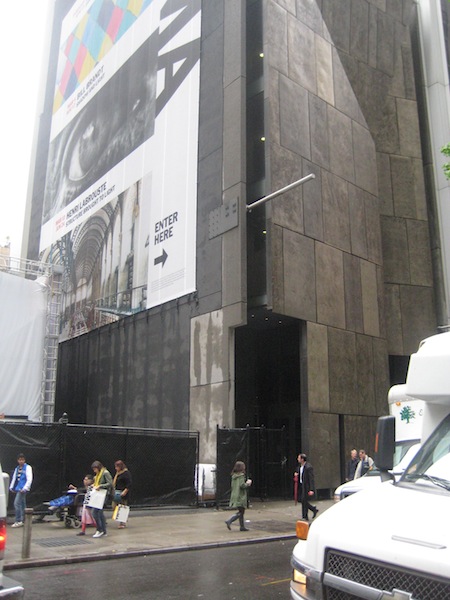
Tod Williams Billie Tsien Architects, the designers of the upcoming Hood Museum expansion and Wilson Hall renovation, are in a strange position regarding their building for the American Folk Art Museum in Manhattan. The refined and well-regarded Modernist building is only a dozen years old and yet is likely to be razed — by its neighbor and owner, the Museum of Modern Art (Times story and blog post, background from Christopher Gray, overview at New Yorker blog).

The firm has a short statement about the museum building on its website, along with photos taken shortly after completion. Here is a Street View of the building made when it was still in use:


The building was fairly desolate on Wednesday:

American Folk Art Museum, Meacham photo

American Folk Art Museum, Meacham photo

But then on Thursday MoMA announced that demolition was not assured, that the building’s fate would be left up to the expansion architects, Diller Scofidio + Renfro (New York Times).

—–
[Update 05.12.2013: Three links to Flash content on TWBTA site removed, New Yorker link added.]

Revealing the spaces within Wilson Hall

Billie Tsien, in an interview in the latest Hood Quarterly (pdf):

After walking through Wilson Hall, I just can’t wait to clean out everything and take a look at the bones. There are some incredibly beautiful and very powerful spaces in Wilson Hall, and stripping it down will help us to see, for example, the height of the top floor and the skylight. People are really just going to be blown away.

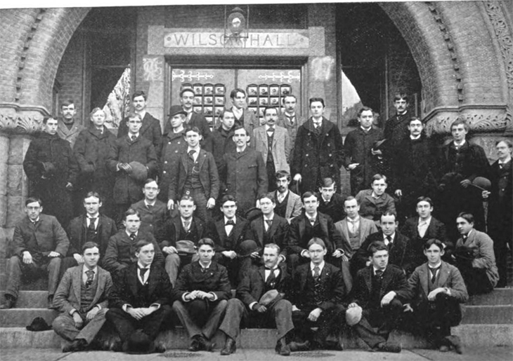
This 1894 photo shows the building’s front entrance.

Wilson Hall entrance 1894

1894 photo of Theta Delta Chi chapter, from Omicron Deuteron, The Shield [of Theta Delta Chi] 10:1 (March 1894), 52 (from Google Books).

Details on Centerbrook’s master plan for the Hood expansion

Centerbrook’s page for its master plan for the Hood suggests that the existing connector to Wilson Hall could be preserved, and it shows the new addition as rising behind the connector.

rough Hood addition plan
Rough sketch of Centerbrook proposal. Base plan from Rogers Marvel 2001 Hood Program Study (pdf).

The addition will obscure most of the front of the Hood Annex, but it will be largely hidden from the Green. In this conceptual plan, at least, the addition is given a signpost in the form of a sort of Joseph Hoffmann ziggurat.

This plan is only a general guide, but it suggests that the preservation of the Wilson Hall entrance is a lost cause. The second and third images on the page show the entire entry below the arch — the stairs, vestibule, door, fenestration, and inscribed granite lintel — demolished and replaced with glazing.

Wilson Hall’s front door will become the Hood Museum’s new principal entry and be transformed by large glass windows to convey transparency and engage passersby on the busy campus green.

A Romanesque building is not the best place to look for transparency… Perhaps a projecting pavilion supporting prominent signage would be just as good, and would also preserve the building’s most distinctive elements. Living with an obtrusive but well-designed entrance and ramp structure outside the building would be a small price to pay to retain the experience of passing through the building’s substantial doorway, with its surfaces of oak, brick, granite, sandstone, and glass.

This master plan led to the Basis for Design for the expansion, and that document will lead to the designs that Williams and Tsien are now beginning. Little more than the general siting of the addition is likely to carry over from the master plan.

More details on that Basis for Design from Art New England (pdf), published a while back:

We intend to go back to the original skin of the building by tearing out the offices and dropped ceiling and returning the Picture Gallery to its original state.

Hood Director Matthew Taylor is referring to Wilson Hall. That link is found in the Hood’s comprehensive page of links about the selection of Williams and Tsien.

—–
[Update 03.28.2016: Broken code in Hoffman link fixed.]
[Update 01.13.2013: Broken link to Palais Stoclet image replaced with Hoffman link.]

Future excitement: the expansion of the Hop

Dartmouth recently announced that it has “initiated a renovation and expansion project for the Hopkins Center and will be selecting an architect in the coming year.” Because the Hop is so large, loved, and important, this is sure to be an interesting project.

On the occasion of the Hopkins Center’s 50th anniversary, the alumni magazine has published a photo essay on the Hop of today and collected reminiscences.

Reading Jonah Lehrer’s New Yorker article mentioning the Pixar building and how Steve Jobs concentrated the restrooms in one place as a way of forcing interaction among employees reminds one of the Hinman Boxes and their placement in the Hopkins Center with the specific intention of exposing students to the arts.1Bohlin Cywinski Jackson designed the 2002 Pixar headquarters, the most important Apple Stores over the years, and Dartmouth’s Class of 1978 Life Sciences Center.

The Black family’s gift for the Visual Arts Center includes the funding of an artwork by Ellsworth Kelly that will be attached to the east facade of Spaulding Auditorium this year (The Dartmouth). See this Street View for the likely site.

The publicity around the Hood expansion and the arts center refers to “Dartmouth’s new Arts District.” It seems that neither “Hopland” nor “SoWhee” has taken hold.

There is the challenge of adding to a notable building by a big-name architect, Wallace Harrison. The various firms doing careful insertions in and around the Harrison-planned Lincoln Center, including Tod Williams Billie Tsien, would be worth considering (Lincoln Center page, Times Topics).

Two recent master plans have proposed that the college graft a variety of additions onto the sides of the Hop:

It will be interesting to see where the new additions will go and how they will look. Will the Hop’s studio range really be demolished and replaced, as the Rogers Marvel plan proposes? Will the blank wall on Lebanon Street really get a row of shops, as the Brook McIlroy plan proposes? Will a northern addition expand the Hop proper toward the Green, alongside the original and iconic Moore Theatre? Stay tuned.

———————-

[Update 07.07.2012: Link to DAM article added.]

———————-

References
1 Bohlin Cywinski Jackson designed the 2002 Pixar headquarters, the most important Apple Stores over the years, and Dartmouth’s Class of 1978 Life Sciences Center.

Yes, Wilson will become the Hood’s main entrance

Dartmouth is putting into effect that Centerbrook master plan noted here on the 4th.

The college took proposals from four firms and today announced the selection of Tod Williams Billie Tsien as the architects for the project (Office of Public Affairs Press Release, Times ArtsBeat).

The project will add museum space behind Wilson Hall, renovate Wilson itself, and turn Wilson’s great arched entrance into the main entrance for the whole Hood Museum complex.

It is difficult to emphasize too much the importance of Wilson’s arch. When Dartmouth published some of Robert Frost’s reminiscences about how he decided, in Wilson Library, to become a poet, it titled the pamphlet “Under That Arch” (American Memory).

Luckily the granite lintel bearing Wilson’s name is not very prominent and can be left in place. A new glass entrance pavilion projecting from the arch or attached to the front of the building will be able to display Hood’s name. The firm’s David Rubenstein Atrium at Lincoln Center (image) suggests one approach the firm could use.

During 1996 I spent about a month living in a Williams/Tsien building at U.Va. (Hereford College, 1992). I had some reservations about the overall project, a residential college on the back of a hill far from the center of campus (map). Because it is sited on a slope, it has trouble enclosing the sort of meaningful outdoor spaces you would expect: it is an arrangement of objects in a park. But I was impressed by the cool and serious Modernism of the individual buildings and their willingness to adopt a monumental scale when required (images from Tinmanic’s Flickr photostream and Wikipedia) . I liked the use of what I assume are local brick and slate on the exterior, and although the cinderblock interior was not ideal for a dormitory, it had a sternness that would be appropriate for a museum.

The firm’s work is serious and purposeful rather than frivolous, and in small doses it could create an exciting tension with Wilson’s Romanesque arches, the Hood’s Postmodern whimsy, and the Hop’s Modernist Expressionism.

—–

[Update 05.12.2013: Two links to Flash content on TWBTA site remove.]

[Update 07.07.2012: The Hood has a roundup of coverage of the announcement. Thanks to Alex Hanson for the quotes in the Valley News article (Hood-supplied pdf).]

Wilson Hall could become the Hood’s main entrance

LC AmMem Wilson Hall

Wilson Hall, from American Memory

This announcement did not get much publicity when it was published almost a year ago, but it is noteworthy: Centerbrook has completed its master plan for the Hood Museum, and the plan contains a proposal to convert the adjoining Wilson Hall into museum space.

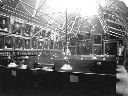
Wilson Hall was built as the college library and picture gallery. Its attic level, with iron trusses supporting a steeply-pitched roof, was designed for the display of paintings.

Wilson historic interior

After the Butterfield Museum was demolished and Baker Library was built behind it, Wilson Hall became the home of the College Museum.

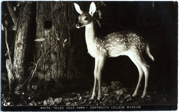
postcard showing deer in Wilson Hall

Charles Moore and the architects of Centerbrook placed their Hood Museum below Wilson Hall during the early 1980s, connecting the two buildings with a whimsically-busy enclosed staircase. The firm also renovated Wilson itself for the use of the Film and Television Studies Department.

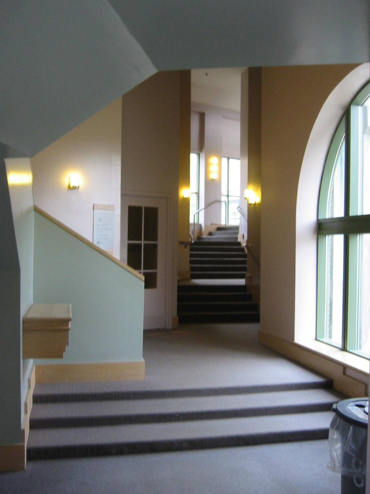
photo of interior of Wilson Hall connector to Hood

Interior of Charles Moore’s Wilson connector, view to south, May 2006

The main entrance to the Hood, of course, was hidden from the view of passers-by. Visitors have to pass through the gate and walk up a broad ramp off to the side.

Now Centerbrook proposes to demolish (presumably) the Wilson connector and replace it with a new three-level addition. New galleries, offices, and classrooms could then go into Wilson and the addition, and Wilson’s presently shadowy entry arch could become the entrance to the whole museum complex:

With some improvements for access to the handicapped, Wilson Hall’s front door will become the Hood Museum’s new principal entry and be transformed by large glass windows to convey transparency and engage passersby on the busy campus green.

Although the large glass windows are a bit worrisome, the overall plan sounds like an excellent one. Will the Hood’s original ramp-entrance remain, or will it too be altered?

——

[Update 04.05.2012: Wilson portrait gallery image added.]